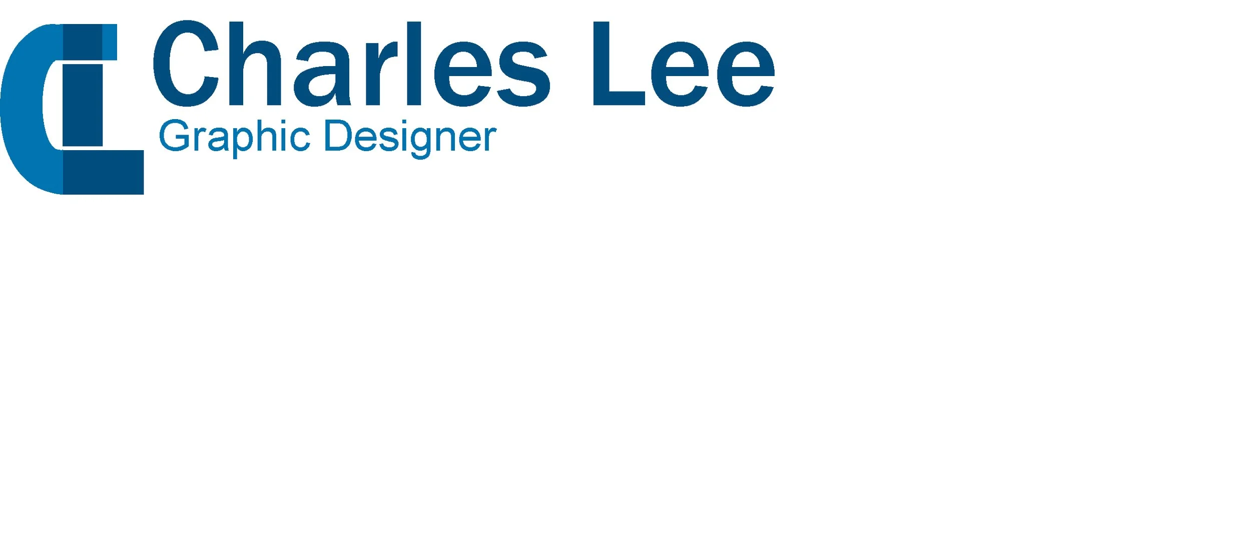
PERSONAL BRANDING
This personal logo was created to represent my identity as a designer. I combined the letters C and L, the initials of my first and last name, and merged them into a single unified form. By interlocking the two letters, I aimed to create a shape that feels both minimal and distinctive, something that reflects my design approach which is clean, intentional, and rooted in strong concept development.
PROJECT DESCRIPTION
RESEARCH & DEVELOPMENT
Brand Strategies
My brand strategy focuses on creating a visual identity that genuinely reflects me as a designer. I wanted a mark that immediately communicates my style while sparking curiosity and inviting people to explore my work. By merging my initials into a single cohesive symbol, I created something personal, professional, and creative. The logo serves as a clear introduction to who I am and sets the tone for the rest of my portfolio.
I don’t have a specific target audience right now. My goal is to get my name out there as a graphic designer and share my work with as many people as possible. Keeping my audience broad gives me the freedom to explore different styles and let my portfolio grow naturally. My strategy is to stay visible, stay consistent, and let my work speak for itself.
Target Audience
PROCESS WORK
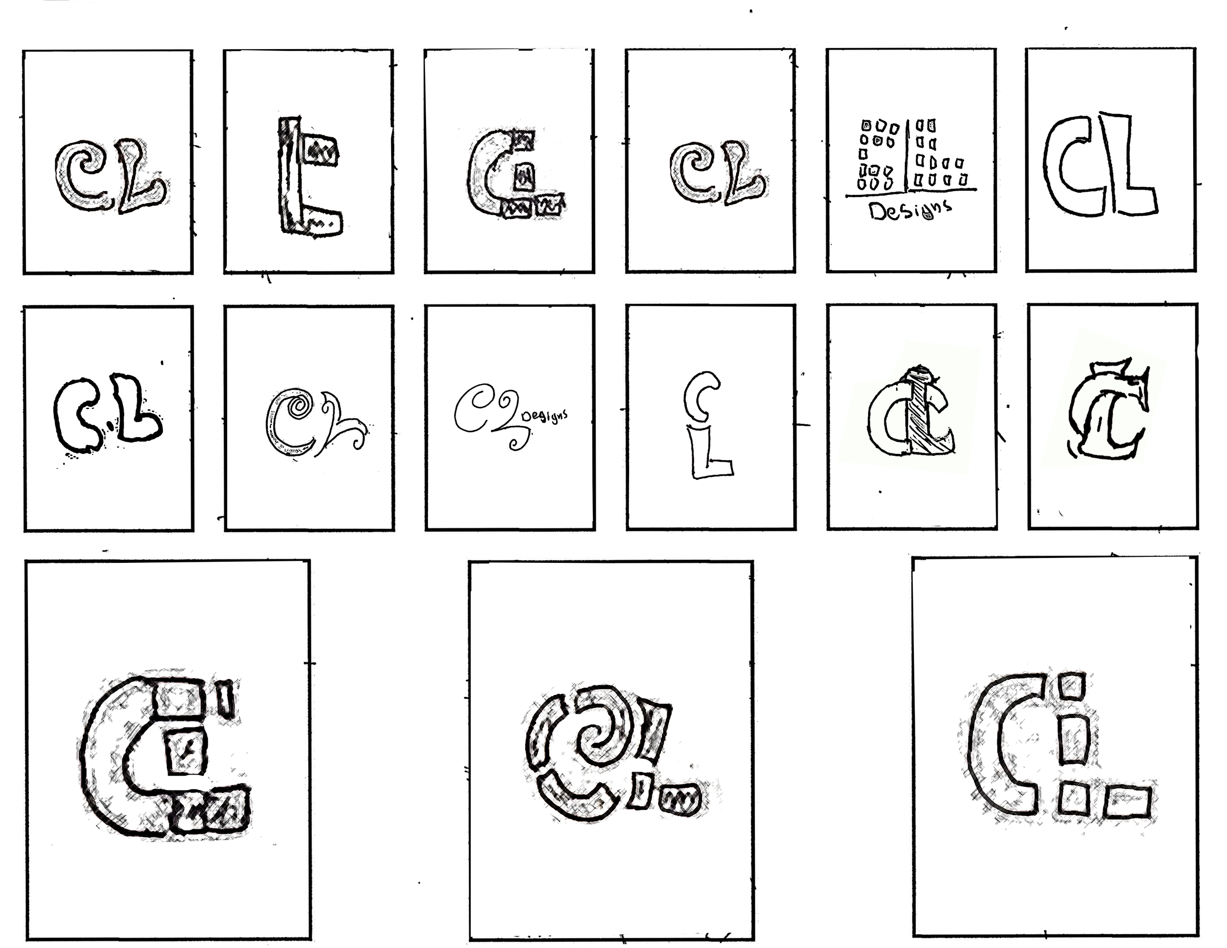
Sketches
I chose Franklin Gothic Medium for its bold, confident look that adds professionalism and pairs well with my logo mark. It brings structure and helps unify my brand identity.
For the title Graphic Designer, I use a lighter typeface to create contrast and maintain a clean, refined feel. This adds hierarchy and helps the logo composition look polished and intentional.
Typography

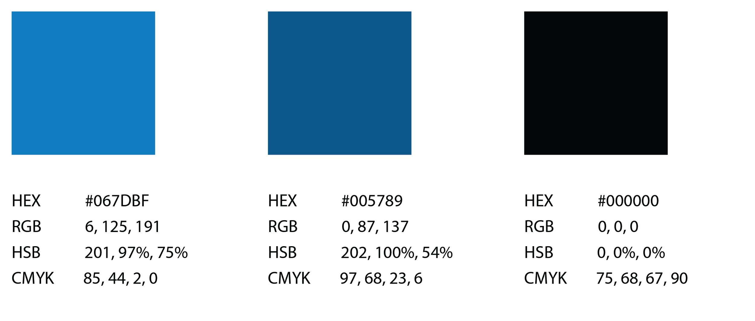
For my color palette, I chose a light blue, a deep blue, and black for the text. Together, they create a clean, professional, and balanced look. The light blue adds a sense of calm and creativity, the darker blue adds depth and stability, and the black text ensures clarity. This palette supports the visual tone and overall identity of my brand.
Color Palette
DIGITAL DRAFTS
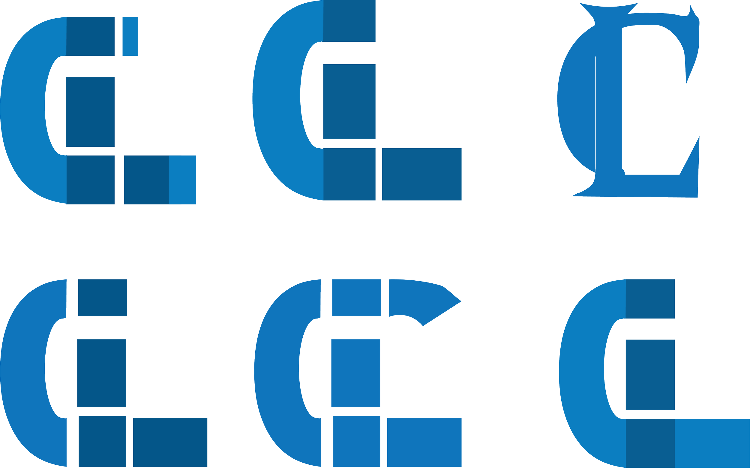
After selecting the sketch that best fit my brand, I refined the C and L initials to align more closely with my visual identity. I then moved my top six sketches into Illustrator to test cleaner shapes, consistent line work, and different compositions within a professional system.
Digitizing the concepts helped me compare them more clearly and decide which direction was strongest. From the six drafts, options 1, 2, 4, and 6 stood out as the best representations of my brand.
Design Decision
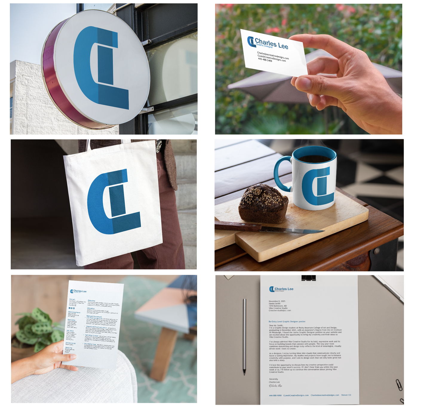
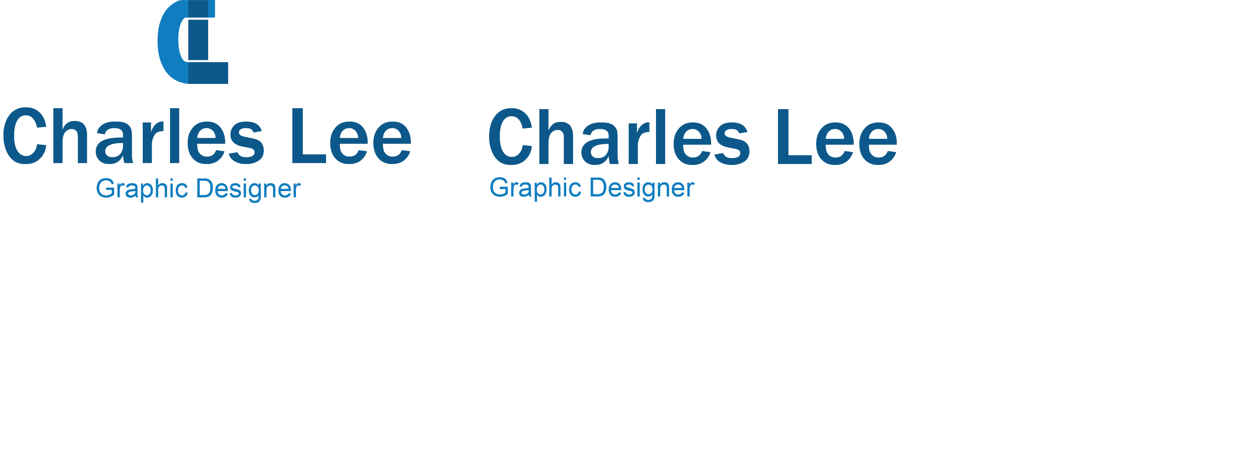
FINAL DESIGN
LOCK UPS
FAVICON