VALENTINES DAY BALL
For this assignment, I created a Valentine’s Day–themed card that visually represents the holiday’s romantic tone. I explored various design ideas and ultimately decided to transform the rose of a flower into the shape of a heart. I began by sketching the concept to capture the movement and organic flow of the petals. After finalizing the sketch, I imported it into Illustrator to refine the heart shape and stem using clean vector lines. I then brought the design into Photoshop, where I added lighting effects, textures, and typography to give the piece a polished, poster-like feel.
PROJECT DESCRIPTION
RESEARCH & DEVELOPMENT
Bandnd strategies focus on defining a unique market position, developing a consistent visual and verbal identity, using storytelling to build emotional connections, engaging the target audience across multiple platforms, delivering a cohesive brand experience, analyzing competitors to identify opportunities, and planning long-term growth through evolving products and marketing efforts.
Brand Strategies
Target Audience
The target audience for this design includes people who appreciate romantic and expressive artwork, especially those looking for meaningful Valentine’s Day cards or decorative prints. This audience values creative visuals, soft color palettes, and symbolic imagery such as roses and hearts. It also appeals to individuals who enjoy personalized and artistic gifts for partners, friends, or loved ones, as well as those who want visually appealing designs for celebrations, home décor, or social media posts during the holiday.
PROCESS WORK
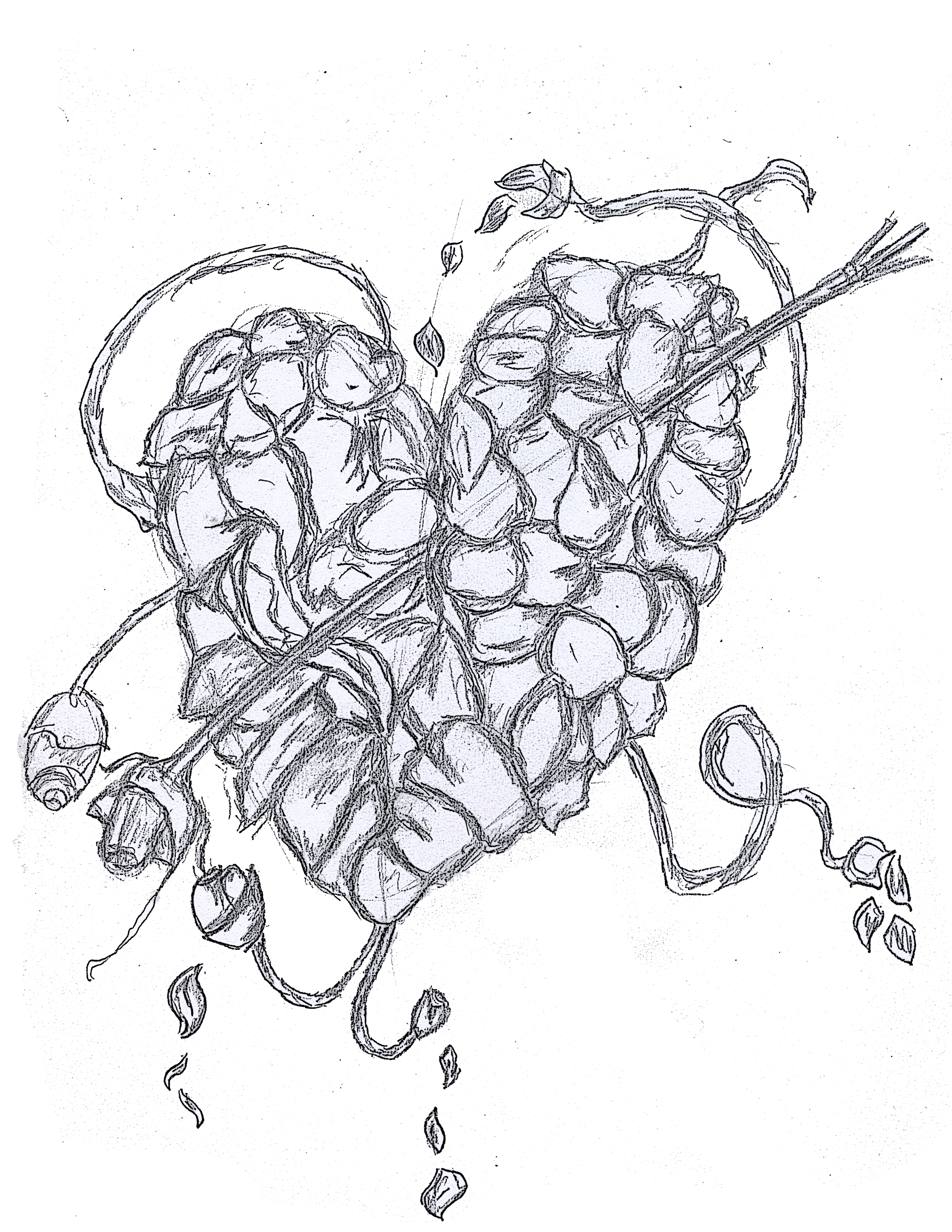
Sketches
Typography
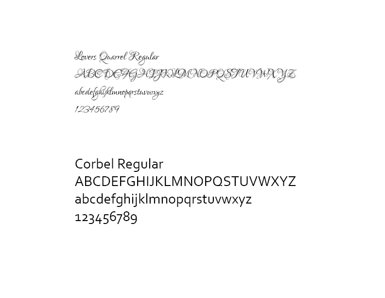
The typography I used for this design includes Lovers Quarrel and Corbel to create a balanced and visually appealing composition. Lovers Quarrel was chosen for its romantic, handwritten style, which adds an expressive and personal touch that complements the Valentine’s Day theme. Corbel was used for supporting text because of its clean, modern, and highly readable appearance, helping to maintain clarity and balance while ensuring the overall design feels polished and professional.
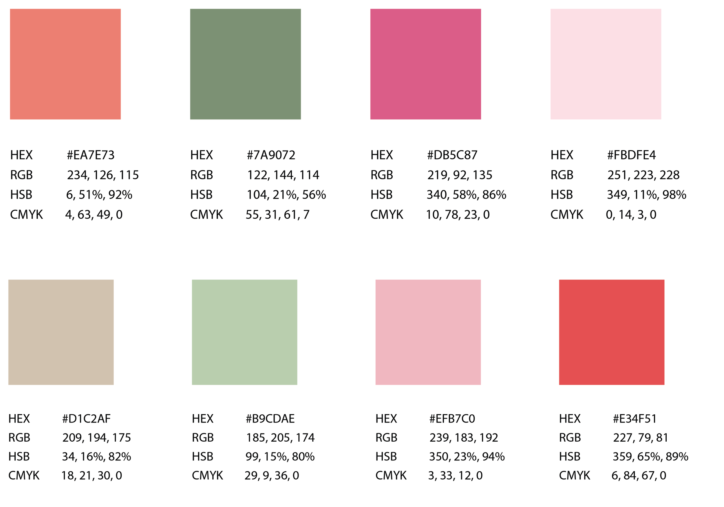
For the colors, I used a vibrant palette to make the design visually striking. The primary colors include light pink, red, and violet to emphasize the romantic and playful tone of Valentine’s Day. Green was used for the stems to add a natural, contrasting element that complements the floral theme. I intentionally chose bright, bold colors to make the design stand out and capture attention while maintaining a harmonious and festive look.
Color Palette
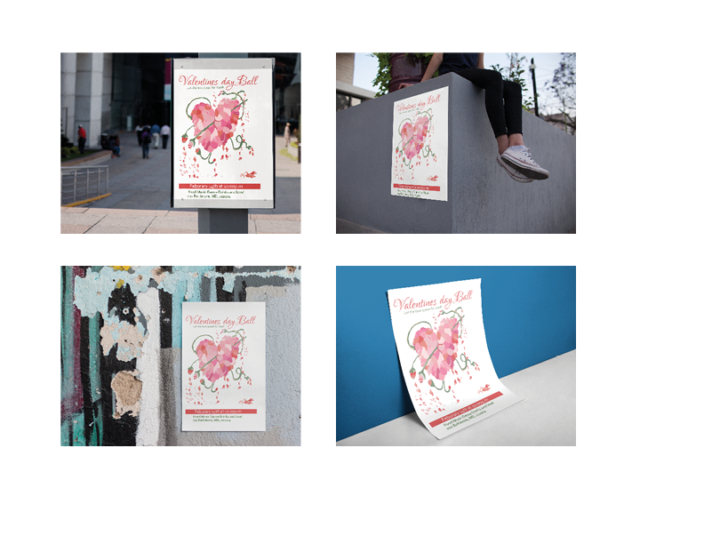
FINAL DRAFTS
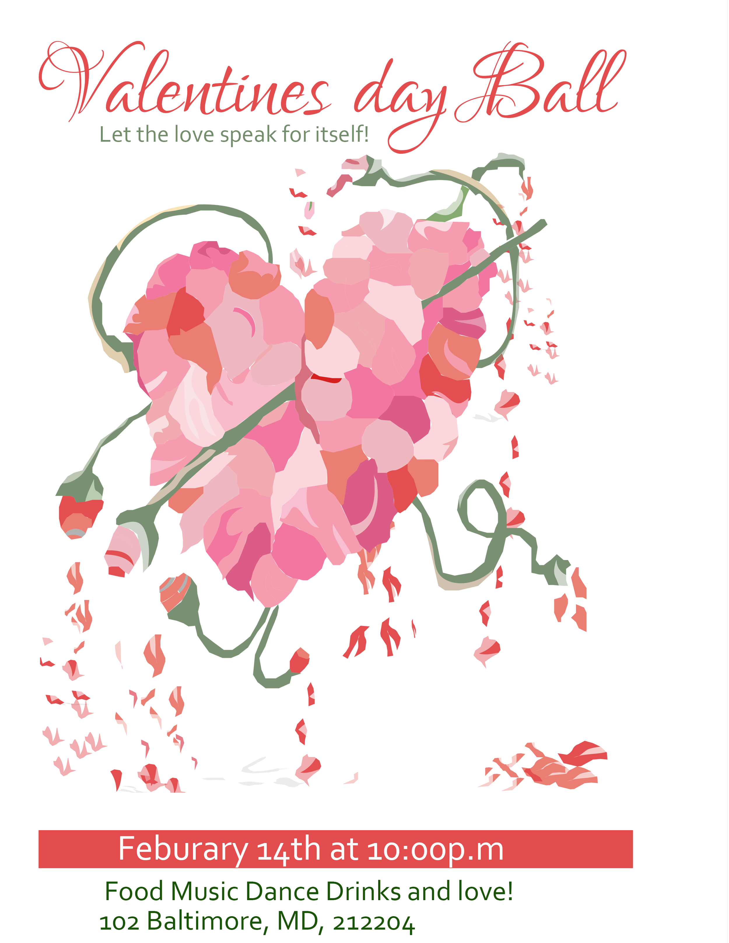
For this Valentine’s Day card, I transformed a rose into a heart to create a memorable and expressive concept. I refined the sketch in Illustrator and enhanced it in Photoshop with textures, lighting, and typography. I used Lovers Quarrel for a romantic feel and Corbel for readability, and a vibrant color palette of pink, red, violet, and green to make the design bright and visually striking.
Design Decision