ANIMAL CRUELTY
I chose to design my brochure about animal cruelty because this issue is important to me. Animals often suffer from abuse and neglect, and I wanted to raise awareness about what cruelty looks like, its impact, and how people can help prevent it.
PROJECT DESCRIPTION
RESEARCH & DEVELOPMENT
Brand Strategies
My brochure uses a compassionate and informative tone to help readers understand the seriousness of animal cruelty. I chose calm, natural colors and clear images of animals to create an emotional connection and encourage empathy. The language is straightforward so the message is easy to understand. The goal of these brand choices is to raise awareness, inspire kindness, and motivate people to take action to protect animals.
Target Audience
This brochure is designed for people of all ages who care about animals or want to learn more about preventing cruelty. It especially targets students, families, and community members who can help spread awareness and promote kinder treatment of animals.
PROCESS WORK
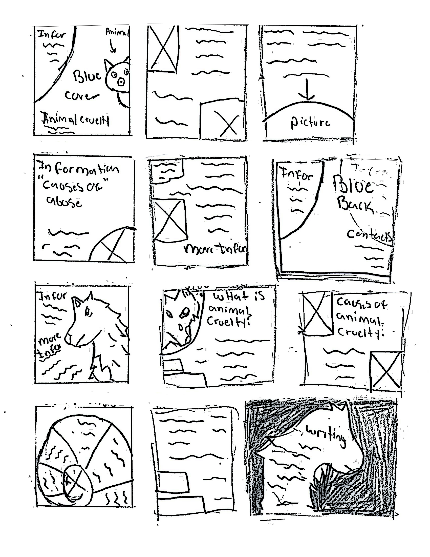
Sketches
Typography
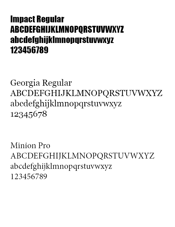
I used Impact for the main headers because it is bold and grabs attention. Minion Pro is used for paragraph text since it’s clean and easy to read. Georgia is used for additional text and subheadings to give the brochure a clear, professional look. Together, these fonts create a readable layout that supports the serious message about animal cruelty.
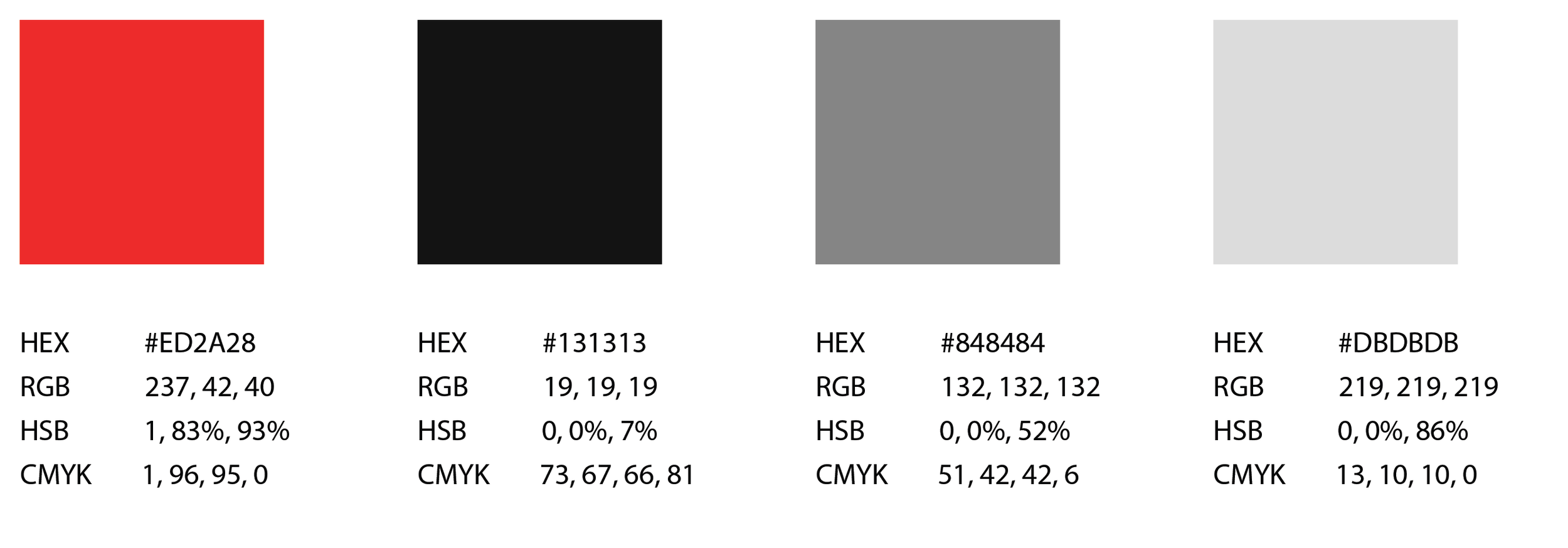
Color Palette
For the colors, I used a mix of dark and light tones to highlight the seriousness of animal cruelty. The darker colors help set a somber, serious mood, while the lighter tones keep the brochure readable and balanced. This combination helps reinforce the importance of the message.
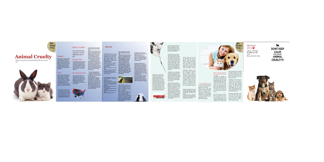
FIRST ITERATION
Design Decision
For the first iteration of my brochure, I experimented with different color combinations, primarily using white, red, and blue to guide the overall design. I included two images of animals on the front to immediately draw attention and create an emotional connection with the audience. This early version focused on capturing interest and visually representing the issue of animal cruelty, while I continued to refine the layout, color choices, and imagery to make the message clearer and more impactful in later iterations.
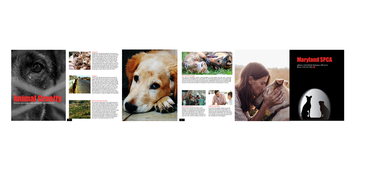
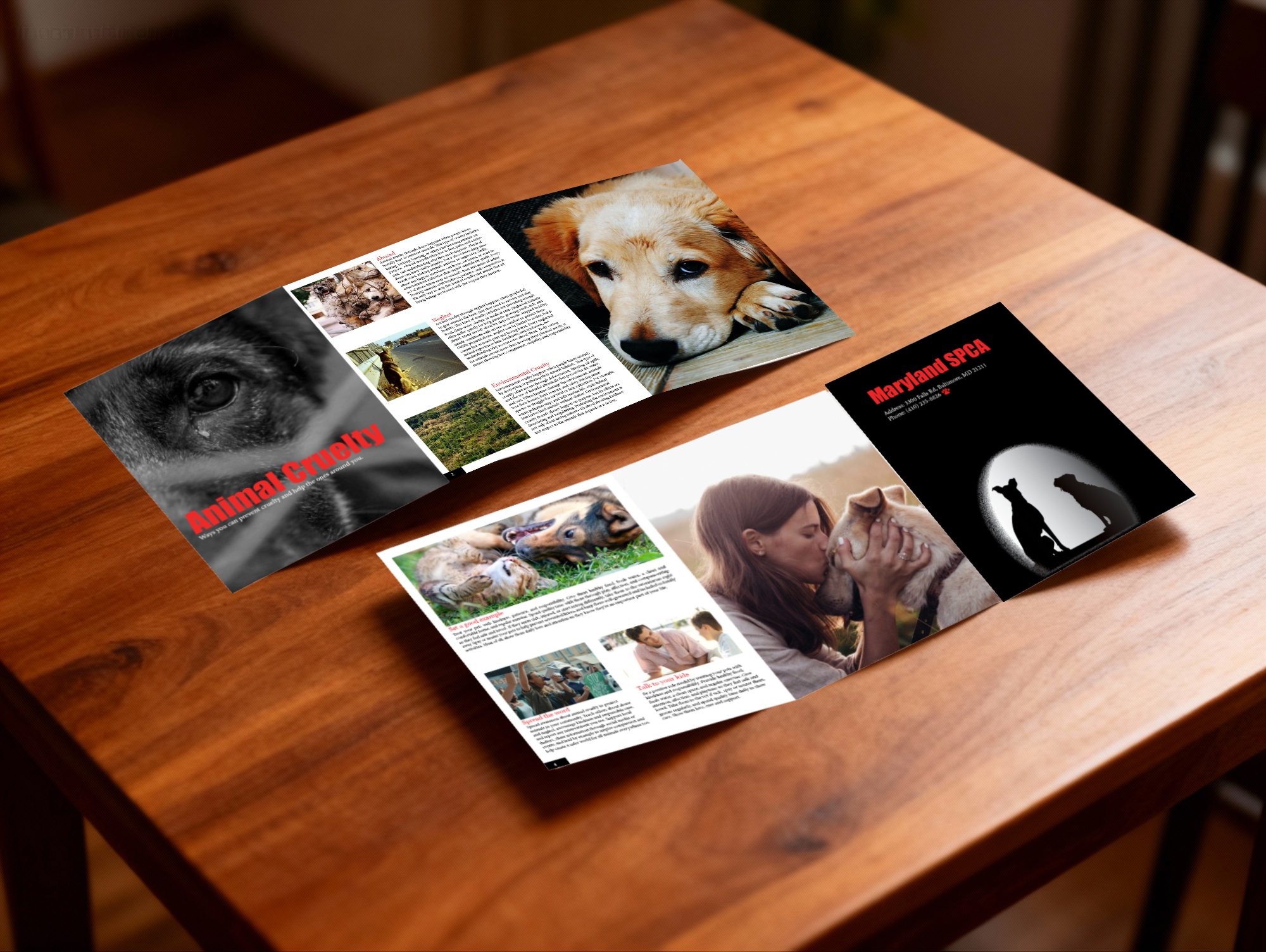
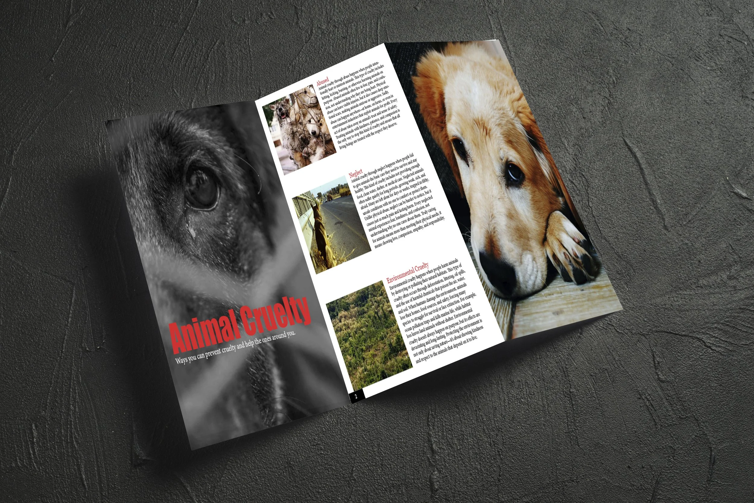
FINAL DESIGN
For the final design, I redesigned the brochure to better convey the message about animal cruelty. I switched from a blue background with red font to a white background with red font for clarity and impact. I also used a close-up image of a dog to show what animals are going through, while including information on how readers can help keep them safe. This layout highlights the seriousness of the issue and encourages action.
Design Decision