TRIPTYCH POSTER
For this triptych poster design, I created three visuals that together convey a unified message about animal cruelty. Each panel explores different aspects of the issue while maintaining a consistent tone, color palette, and design, creating a cohesive and impactful statement.
PROJECT DESCRIPTION
RESEARCH & DEVELOPMENT
Brand Strategies
The brand strategy aimed to raise awareness about animal cruelty by creating a three-part poster that visually reveals what is happening behind the scenes. Each panel highlights a different aspect of the issue, guiding viewers through a clear and impactful narrative that encourages them to recognize the reality of animal suffering and take action
Target Audience
The brand strategy aimed to raise awareness about animal cruelty by creating a three-part poster that exposes what is happening behind the scenes. Each panel highlights a different aspect of the issue, designed to inform and emotionally engage a broad audience, especially young adults and community members who may not be fully aware of the realities of animal suffering.
PROCESS WORK
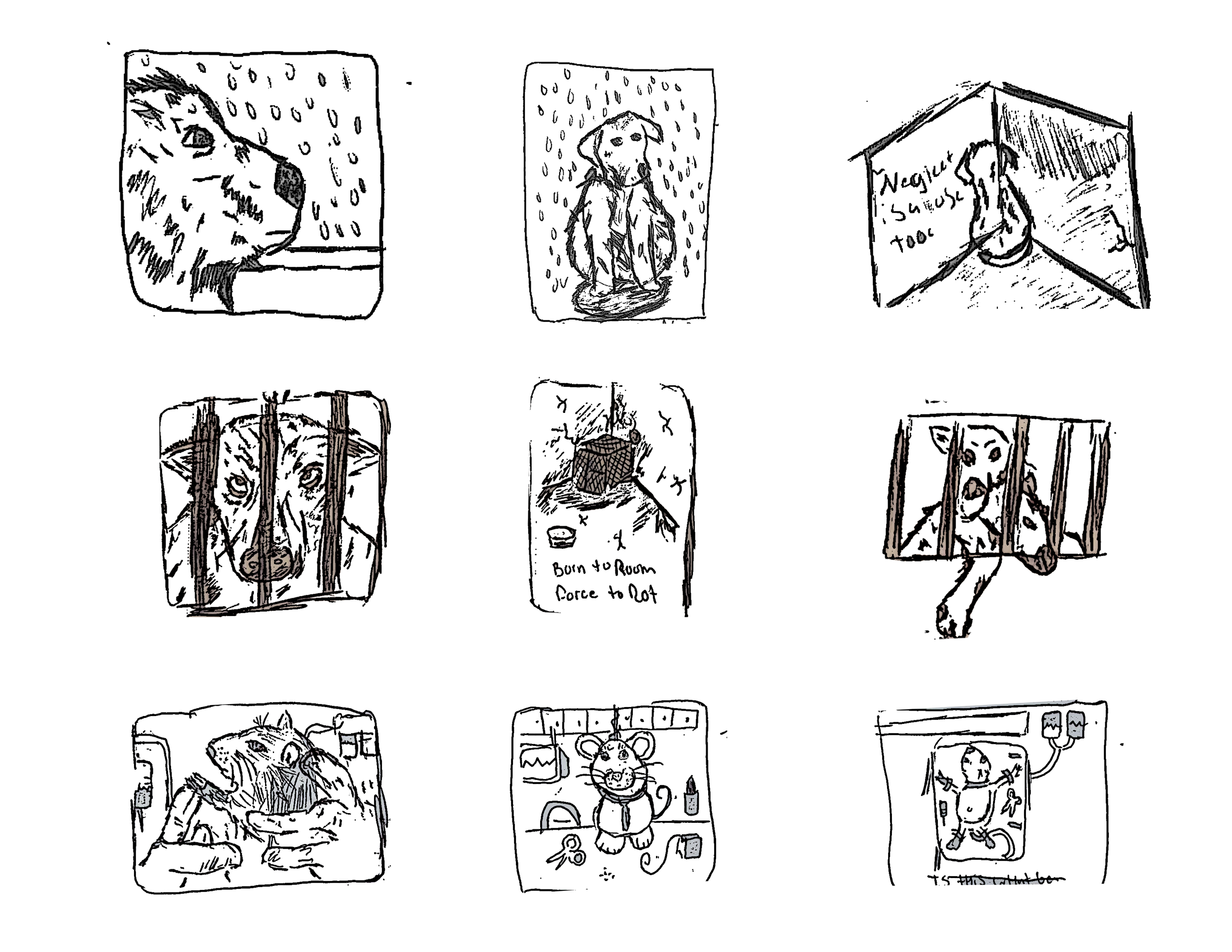
Sketches
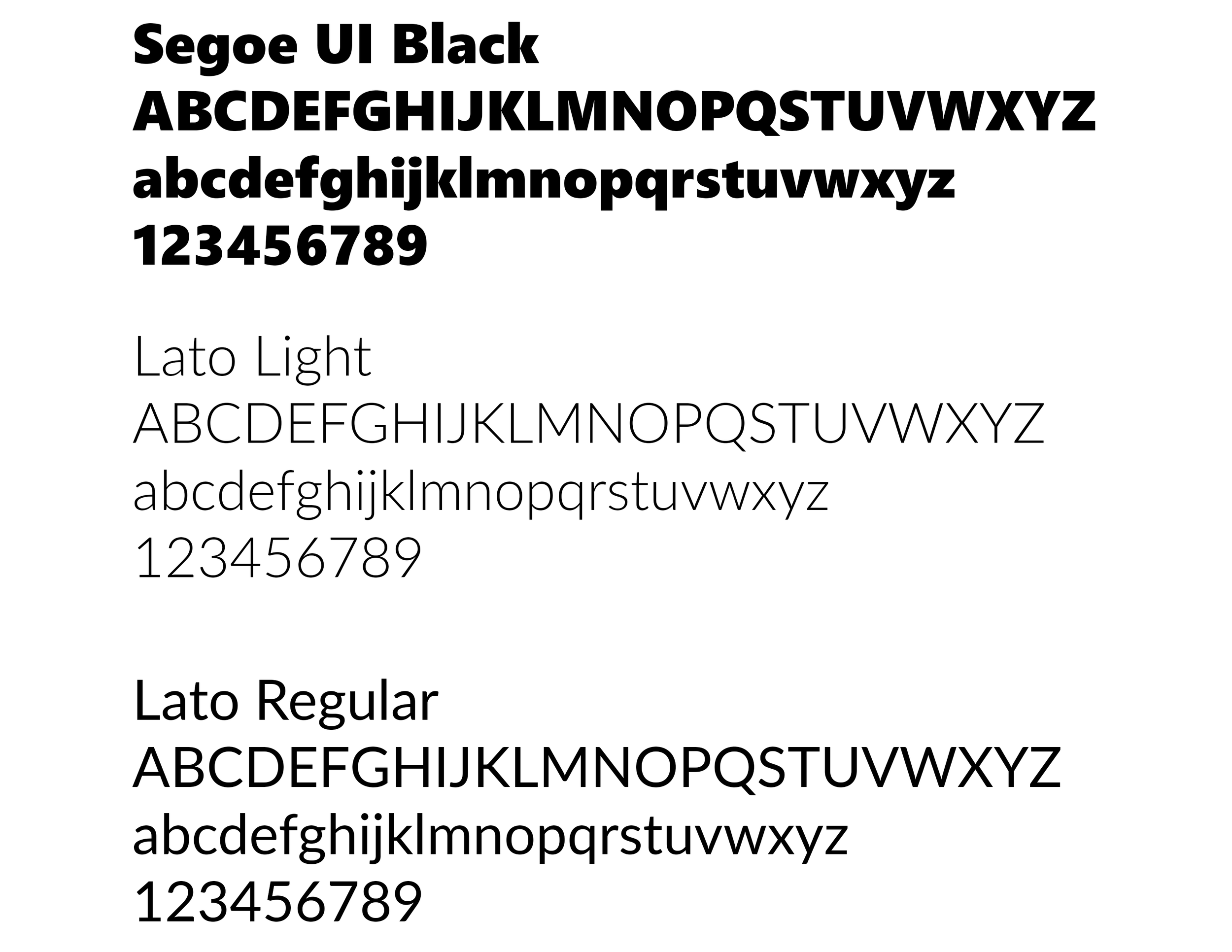
Typography
For typography, I used Segoe UI Black for the headers, Lato Light for the sub-headers, and Lato Regular for the body text. This consistent type hierarchy helped keep the messaging clear, emphasized key points, and visually tied all three posters together for a unified design.
Color Palette
For the color palette, I chose colors that would represent the triptych poster while making a bold visual impact. I wanted hues that would immediately draw the viewer’s attention and make the subject matter clear at a glance. By using high contrast colors, the designs highlight the key elements of each panel and emphasize the seriousness of the issue. The palette also helps unify the three panels, creating a cohesive and striking visual narrative that guides the viewer’s eye and reinforces the message about animal cruelty.
FIRST ITERATIONS
Design Decision
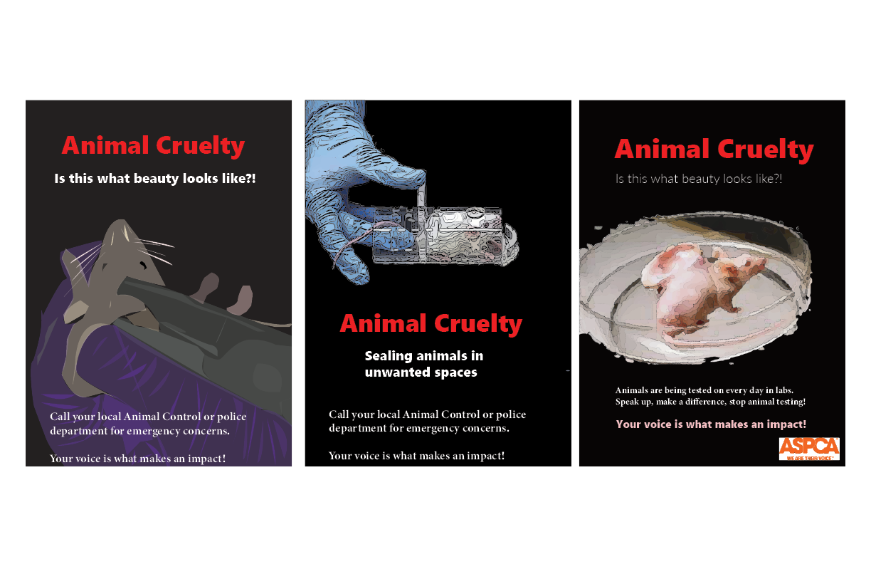
For my first iterations, I used red, white, and black as the main color palette to create a strong and dramatic visual impact. I incorporated both illustrations and photographic elements to highlight the cruelty that animals experience. These early designs focused on showing the direct effects of the mistreatment, using intense imagery and contrast to emphasize pain, fear, and vulnerability. By combining expressive artwork with real visual references, the iterations aimed to make viewers immediately aware of the harsh realities these animals face.
SECOND ITERATIONS
Design Decision
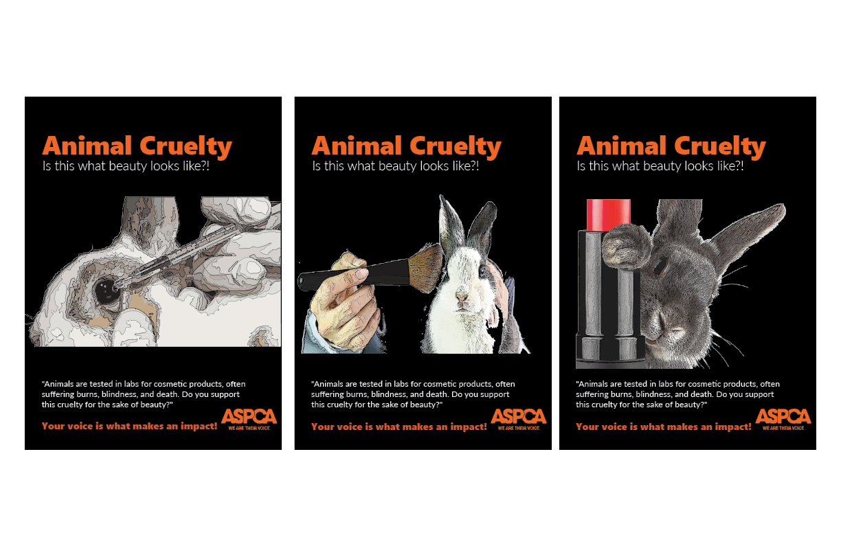
For the second part of my triptych poster, I shifted to using mostly images across all three panels to focus closely on the cruelty animals face. I adjusted the alignment and composition for better visual flow and used orange, white, and black as the main colors, with additional tones in the images to highlight key details. These changes made the overall message more cohesive and impactful.
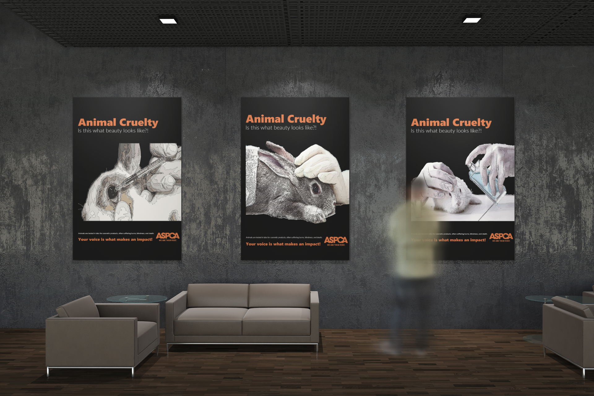
FINAL DESIGN
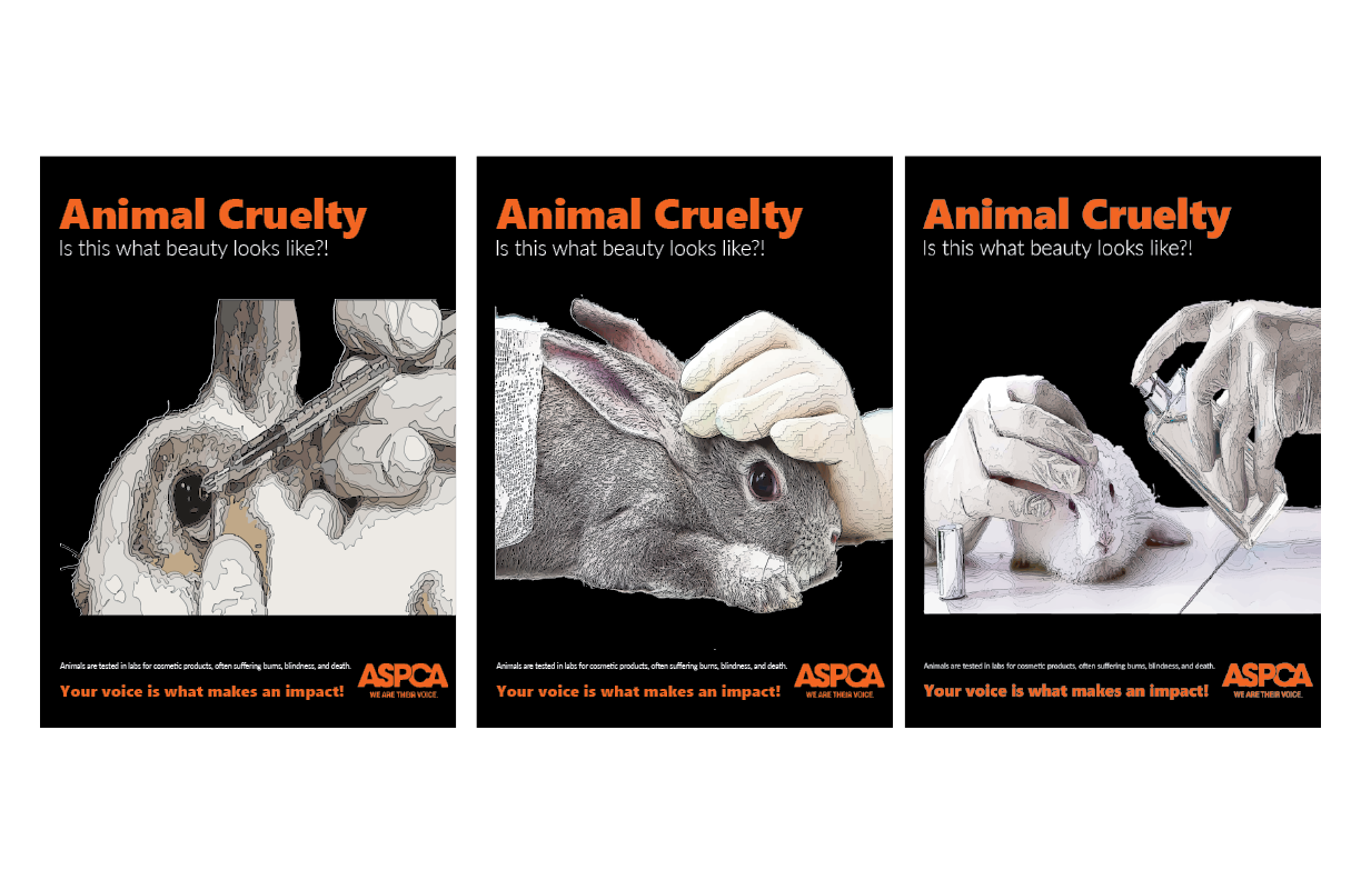
For my final triptych poster design, I kept a consistent color palette and mood across all three panels. I used orange, black, and white to create a bold, unified look that reinforces the seriousness of the topic. The close-up images were chosen to create an emotional impact and make viewers confront the reality of animal cruelty. This combination of color, imagery, and tone helps the entire set feel cohesive while delivering a powerful message.
Design Decision
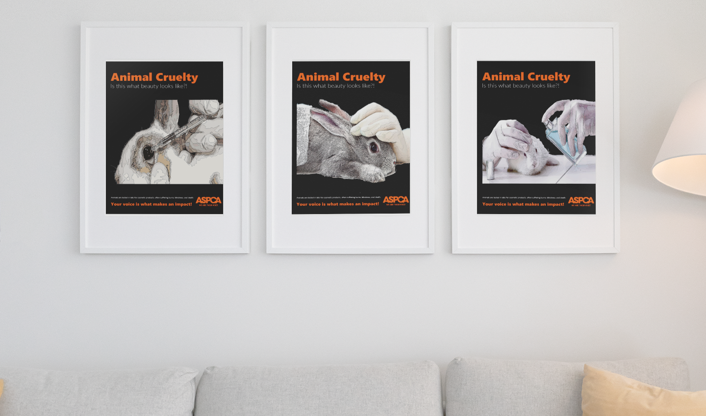
ENVIRONMENTAL CONTACT