WASH UP
PROJECT DESCRIPTION
RESEARCH & DEVELOPMENT
For this design project, I created a new Bath & Body Works product tailored for women aged 30-40. The product aims to provide a luxurious, everyday experience with a focus on self-care and relaxation. Combining sophisticated scents and premium ingredients, it delivers both indulgence and practicality for modern women seeking balance and wellness in their busy lives.
The strategy focuses on positioning the product as a premium self-care essential for women aged 30–40. Branding highlights clean, high-quality ingredients, modern fragrance profiles, and a sense of everyday luxury. Packaging uses refined colors and minimal design to signal maturity and sophistication. Marketing emphasizes wellness, confidence, and balance, connecting the product to a dependable, elevated self-care routine.
Brand Strategies
Target Audience
The product is designed for women ages 30 to 40 who value high quality skincare and simple, effective self care. They look for products that feel luxurious, smell sophisticated, and support a busy lifestyle. This audience prefers clean ingredients, reliable hydration, and fragrances that feel mature, refreshing, and modern. The product fits their desire for everyday routines that feel elevated and enjoyable.
PROCESS WORK
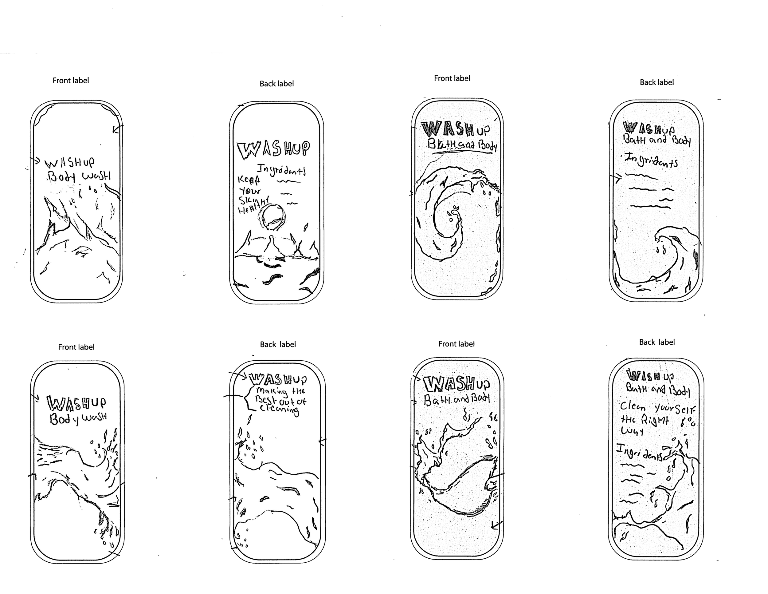
Sketches
Typography
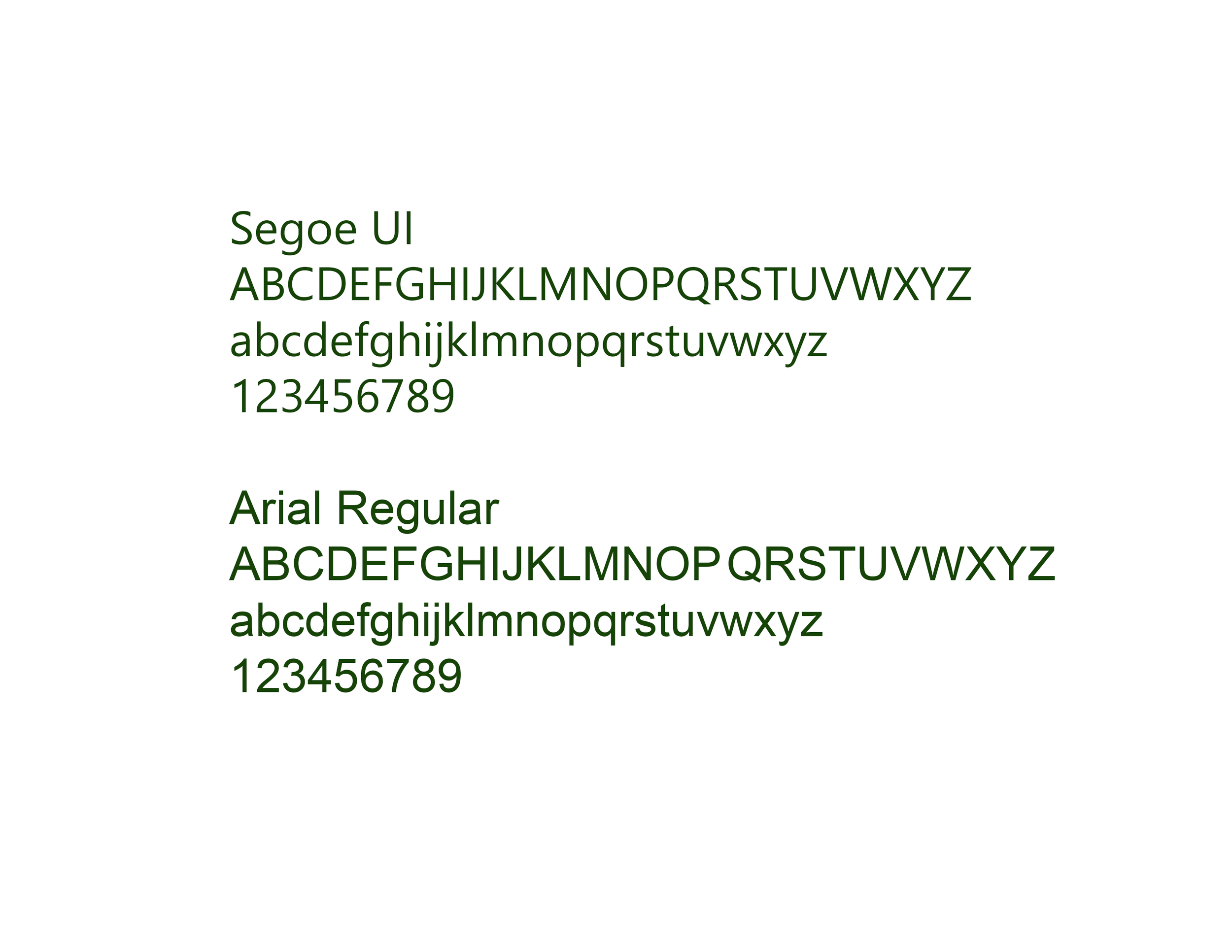
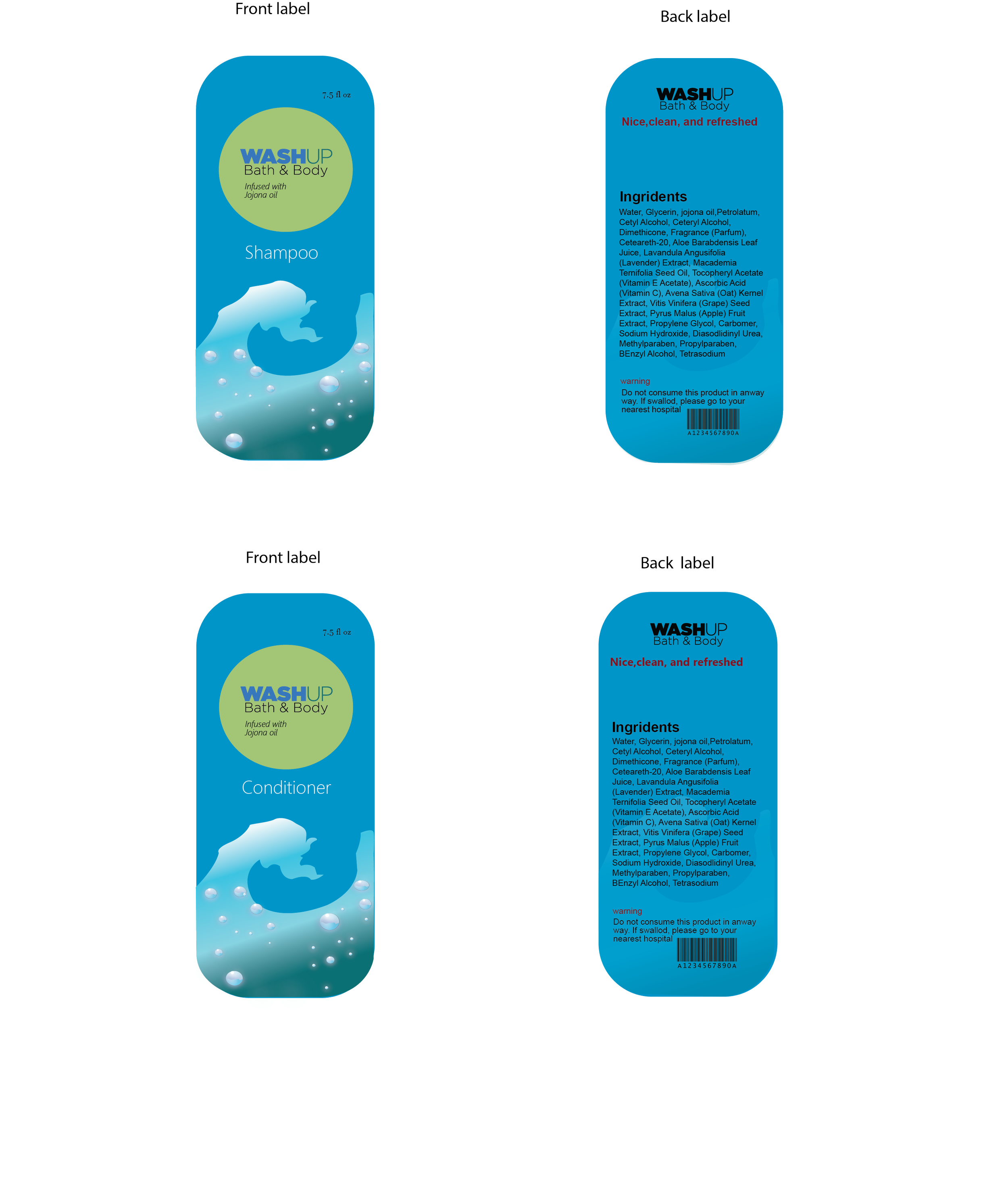
For this Bath & Body Works redesign, I chose typography that suits women ages 30 to 40 with a clean and modern look. Segoe UI Header is used for main titles like “Body Lotion” and “Body Wash” to create a fresh, appealing presence, while Arial Regular serves as the body copy to keep all product information clear and easy to read. Together, these typefaces create a simple and professional visual hierarchy.
Color Palette
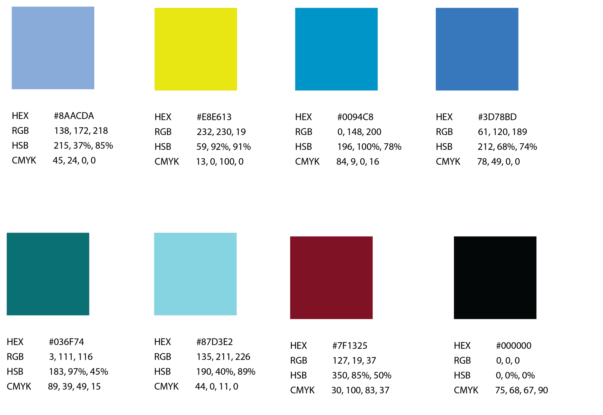
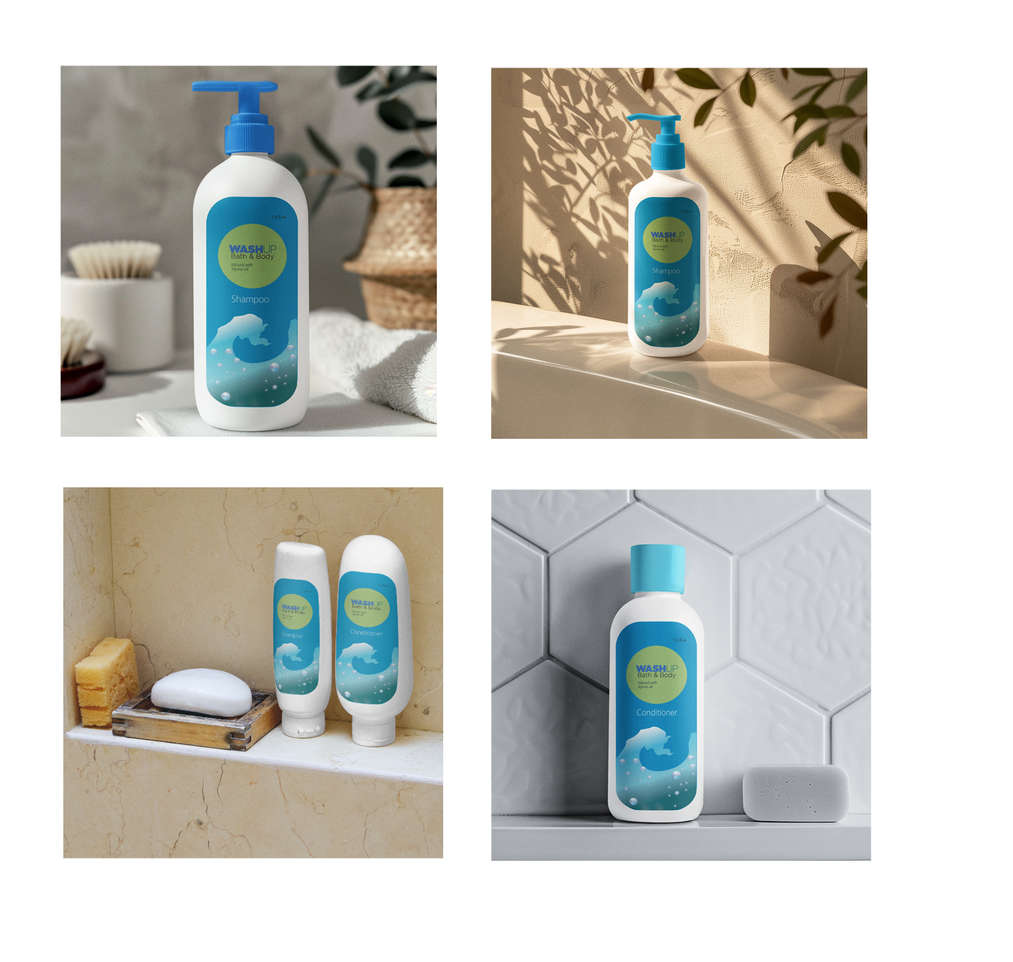
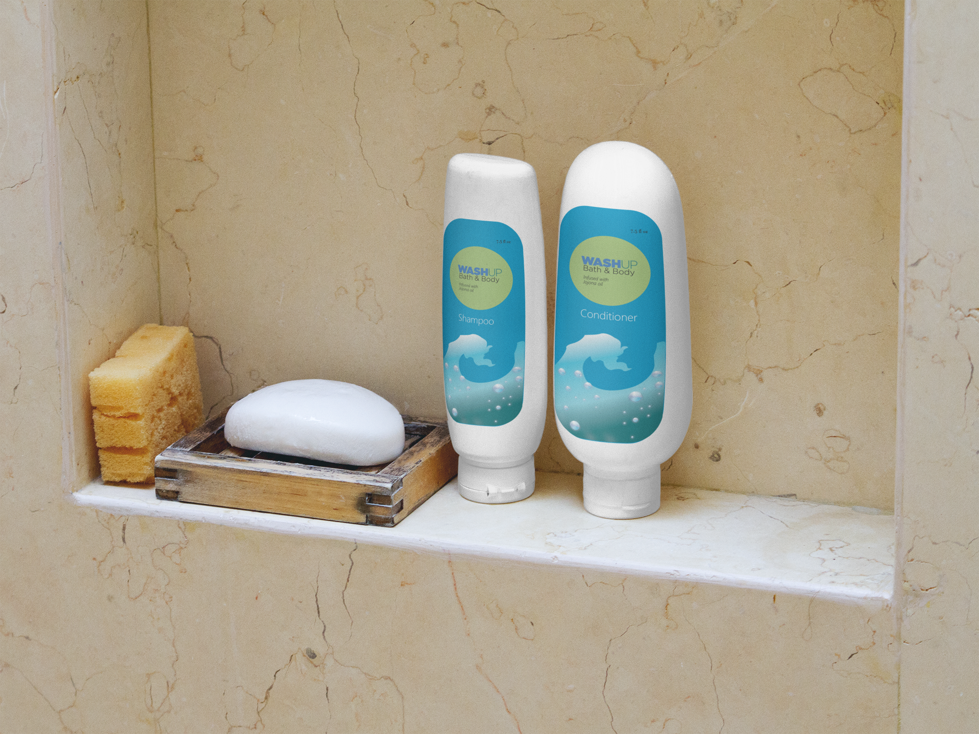
For the color palette, I chose blue to represent the women’s lotion and body wash. This color helps the product stand out while maintaining a cohesive visual identity for the WashUp line. Blue conveys calmness, freshness, and cleanliness, which supports the soothing and uplifting qualities of the product. I applied the color consistently across the packaging to create a strong visual presence and ensure it fits naturally within the brand family. The palette also works well with the wave and sunlight motif in the sketches, adding brightness, movement, and a refreshing feel. Overall, the goal was to create packaging that feels modern, eye catching, and aligned with the product’s calming and energizing experience.
FIRST ITERATIONS

Design Decision
In my first iterations for the WashUp Bath and Body Works product, I experimented with different layouts to find a direction that felt clean, balanced, and purposeful. I explored several sketches to see how the product’s identity could be presented clearly without overcrowding the design. I originally planned to use pink because I wanted the design to appeal more to women, and I felt the lighter tones would support a soft, gentle look. These early trials helped me understand how color and layout could shape the product’s overall feel and message.
FINAL DESIGN
Design Decision
When sketching concepts for the WashUp Bath & Body Works product, I experimented with several layouts to find a direction that felt clean and purposeful. I ultimately chose a sketch that simplified the design while still highlighting the product’s identity. Although I first considered using pink, I realized that a light blue created a stronger sense of calm, freshness, and brand clarity. The blue also blended better with the overall composition and supported the product’s gentle, refreshing theme. This choice helped the final design feel more intentional and visually balanced.
ENVIRONMENTAL CONTACT