This project focuses on creating a poster slam design targeted at adults ages 25–35. The goal is to develop a bold, modern visual style that reflects the energy and creativity of this audience. Through strong typography, vibrant colors, and engaging layout choices, the poster aims to capture attention, promote a fun and social atmosphere, and clearly communicate the event’s purpose. The final design will showcase a cohesive brand strategy that connects with the lifestyle and interests of this demographic.
POSTER SLAM
PROJECT DESCRIPTION
RESEARCH & DEVELOPMENT
My brand strategy focuses on reaching adults ages 25–35 by creating a bold, modern, and energetic visual identity. This age group values creativity, social experiences, and authentic expression, so the brand emphasizes vibrant design, clear messaging, and an upbeat tone. The goal is to connect with their lifestyle, attract their attention quickly, and make the experience feel fun, current, and relatable..
Brand Strategies
For my poster slam design, I chose a target audience of ages 25–35. This group is socially active, enjoys creative events, and appreciates bold, modern visuals. Designing with them in mind helps make the poster feel relevant, engaging, and appealing to their interests.
Target Audience
PROCESS WORK
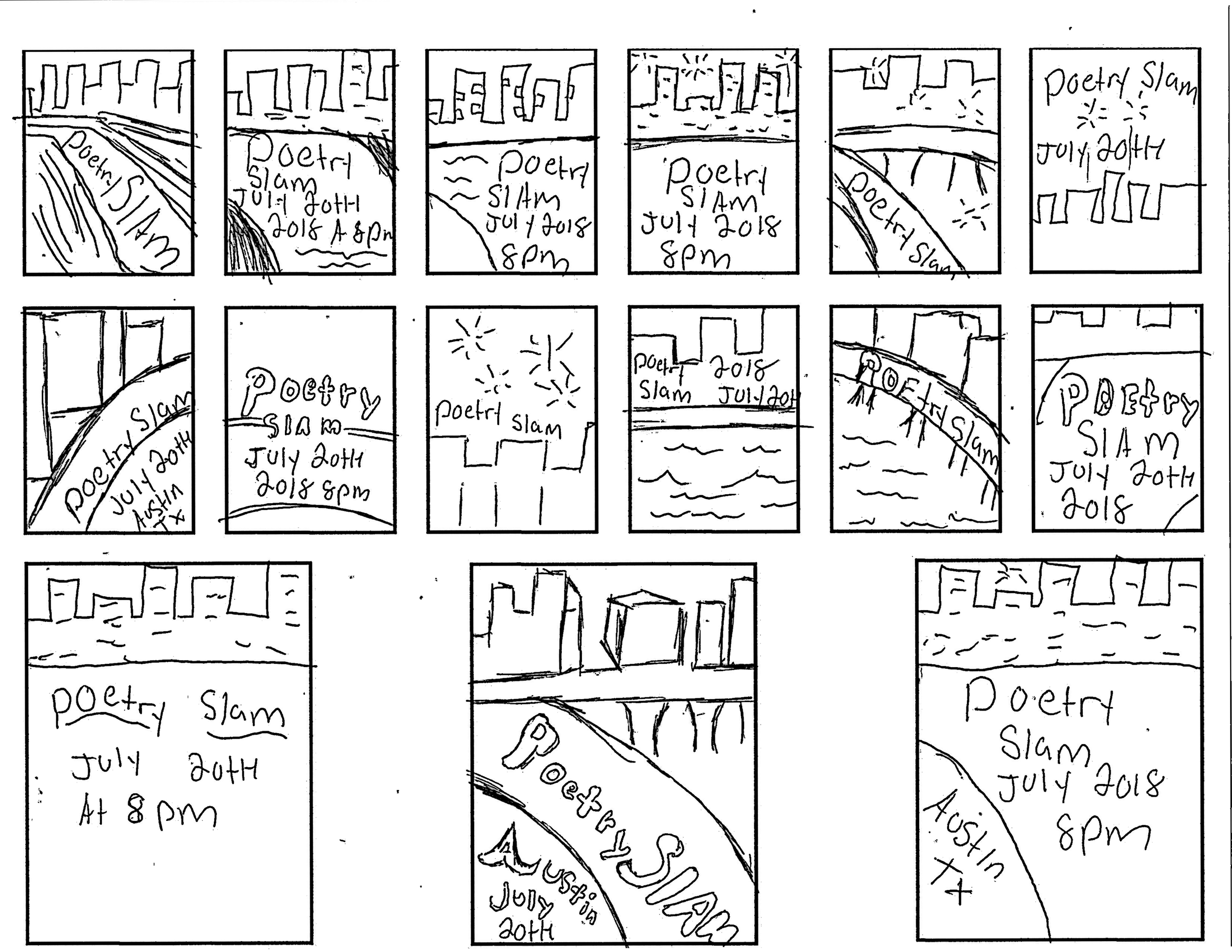
Sketches
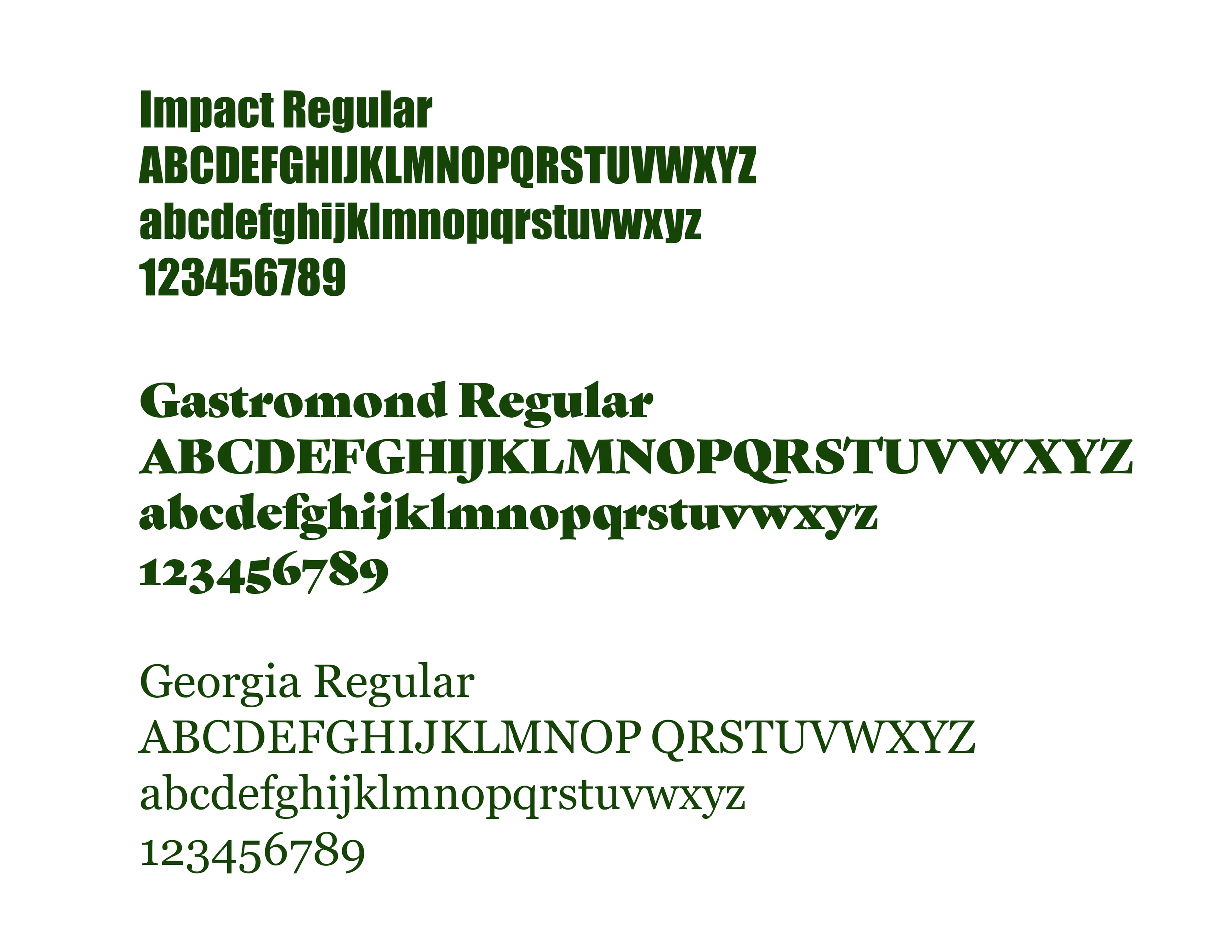
For the poster slam header, I chose Impact because its bold, heavy style adds strong visual presence and suits the overall design. For the second header, I used Gastromond Regular, which introduces a more expressive, refined contrast. For the body text, I selected Georgia Regular since its readability and classic structure balance the other two fonts and tie the layout together.
Typography
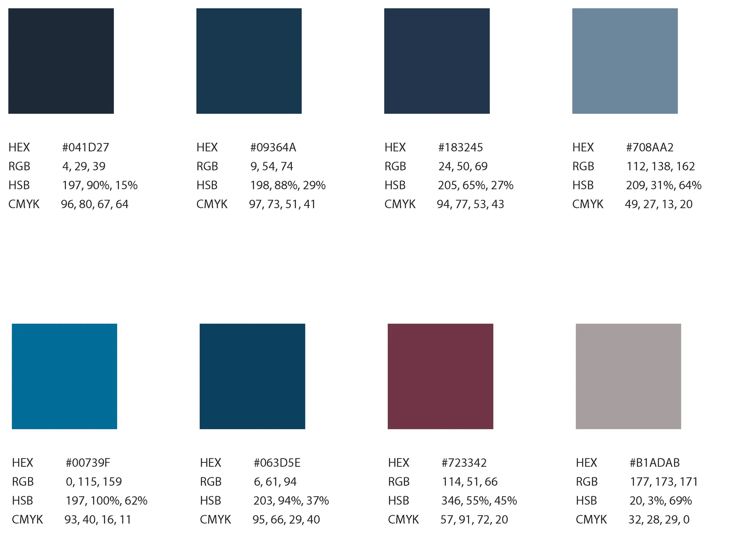
For my color palette, I chose a light blue, a deep blue, and black for the text. Together, they create a clean, professional, and balanced look. The light blue adds a sense of calm and creativity, the darker blue adds depth and stability, and the black text ensures clarity. This palette supports the visual tone and overall identity of my brand.
Color Palette
FIRST ITERATION
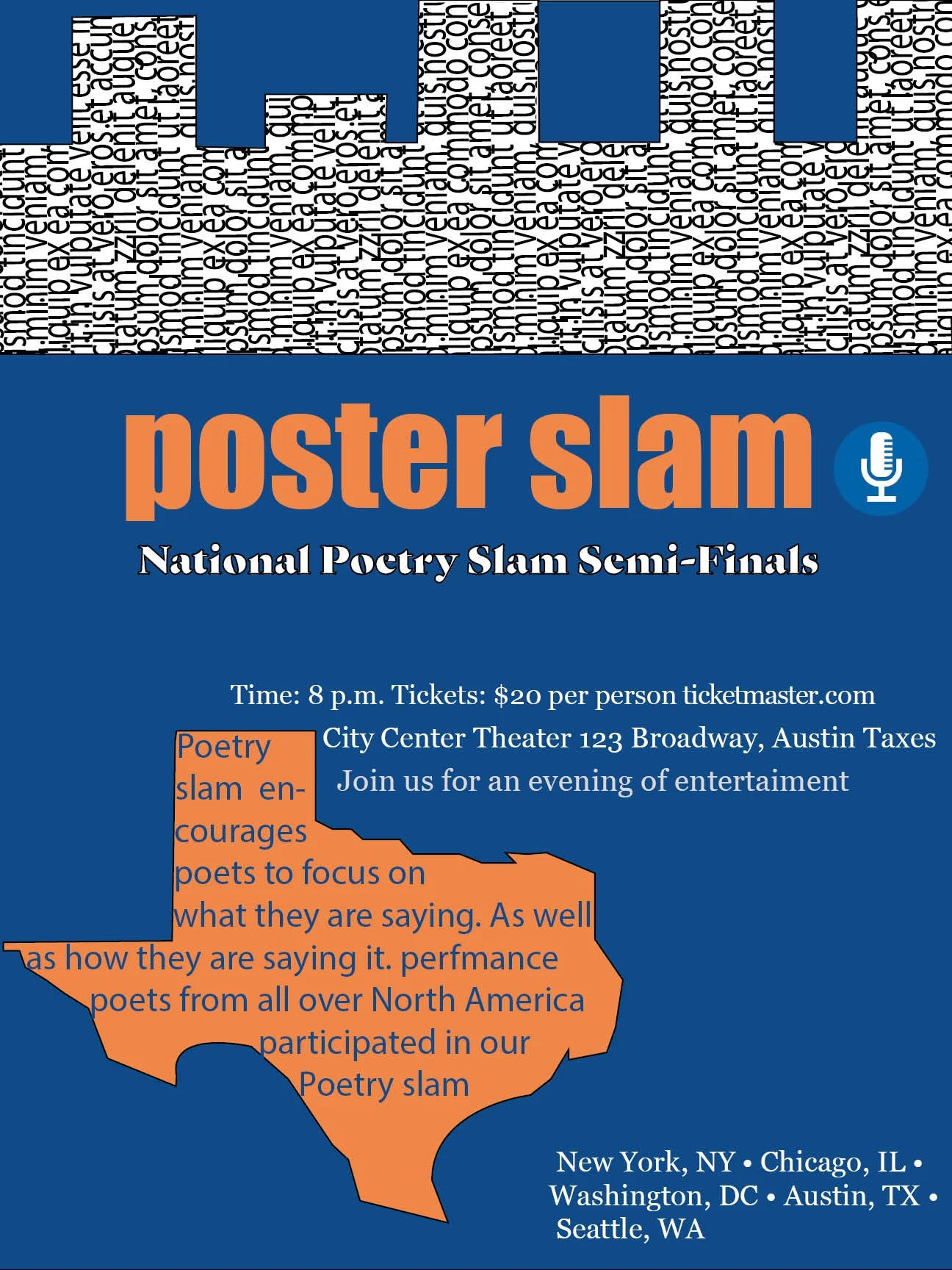
For the first iteration draft, I chose orange, blue, and white as the primary colors for the poster slam design because they create a strong and energetic contrast. I used a cityscape in the background and integrated text into the buildings to emphasize depth and movement. I also included a stylized outline of Texas and incorporated additional text within the shape to connect the design more directly to its location and theme.
Design Decision
SECOND DESIGN
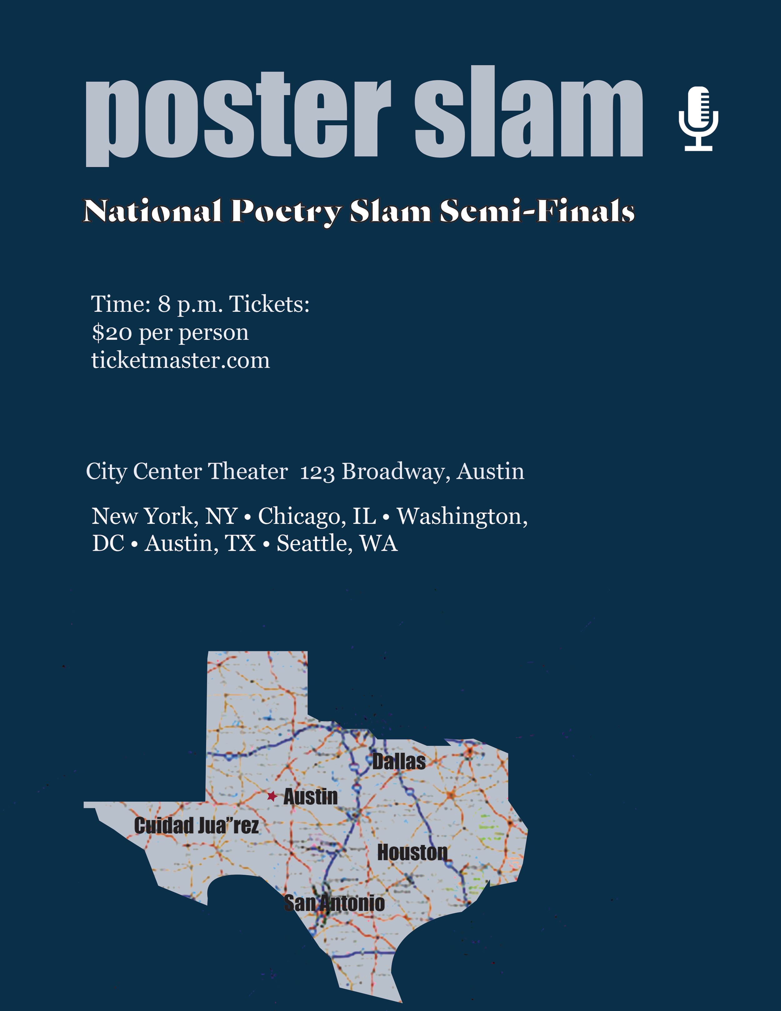
For the second iteration, I switched to a new color palette, using a darker blue, a lighter blue, and white to create a cleaner and more cohesive look. Instead of keeping the city in the background with text embedded in it, I removed that element and repositioned the text toward the top for better alignment and readability. I also added a map inside the Texas shape I created, which added more visual interest and strengthened the connection to the theme.
Design Decision
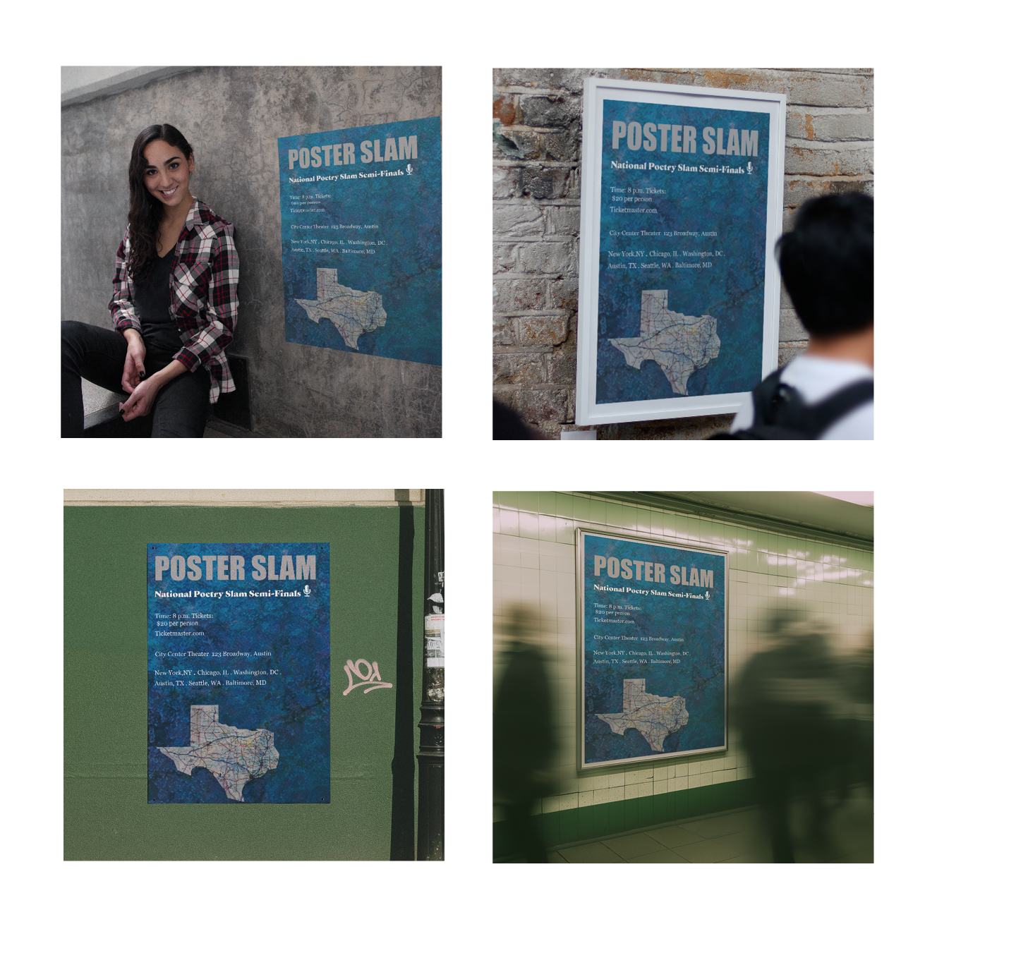
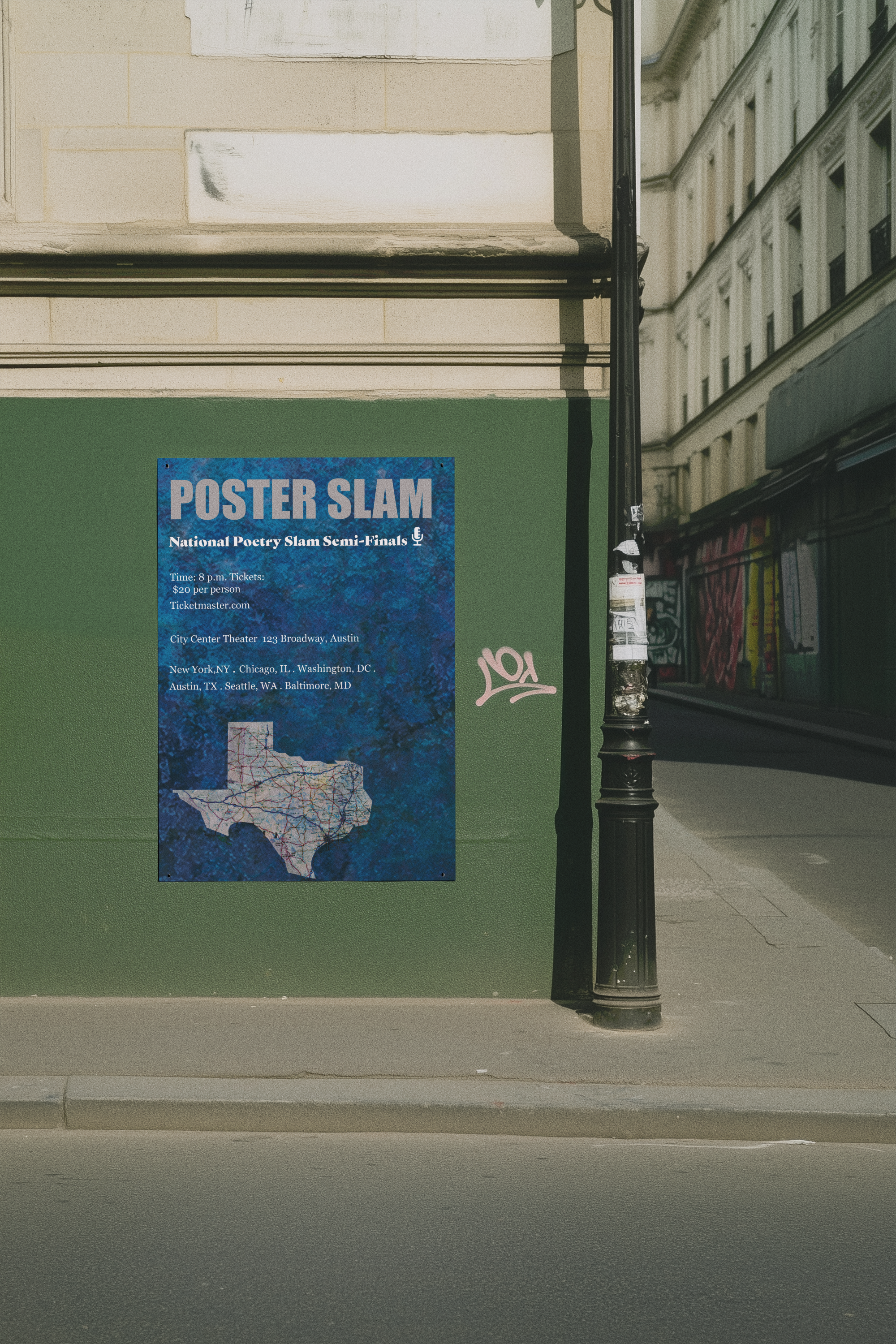
FINAL DESIGN
Design Decision
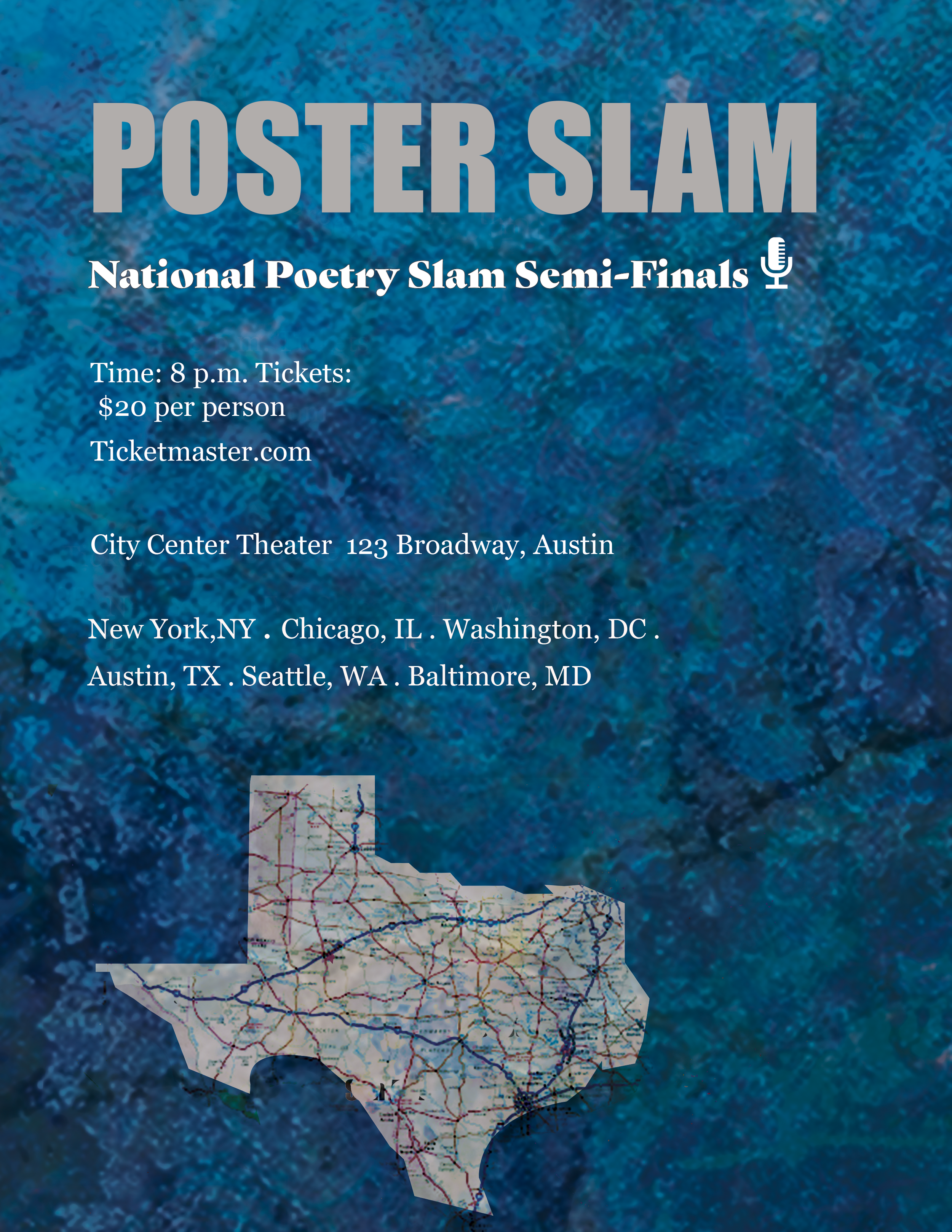
For the final design, I kept the overall structure similar to the second iteration but focused on adding more depth and character. I introduced subtle texture in the background to create a richer visual atmosphere and to help the elements feel more connected. This added dimension brings the colors, typography, and Texas motif together in a more unified and engaging way.