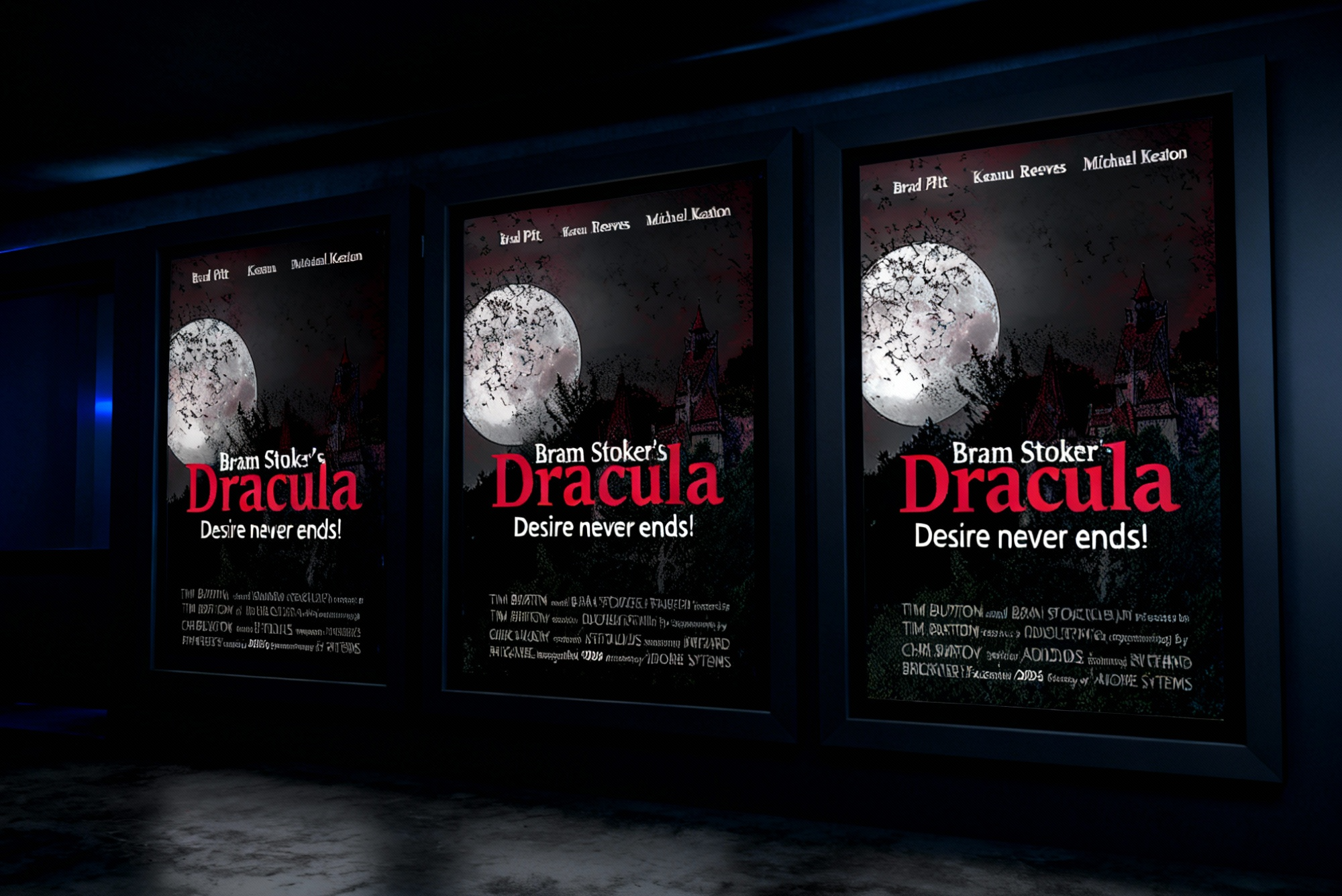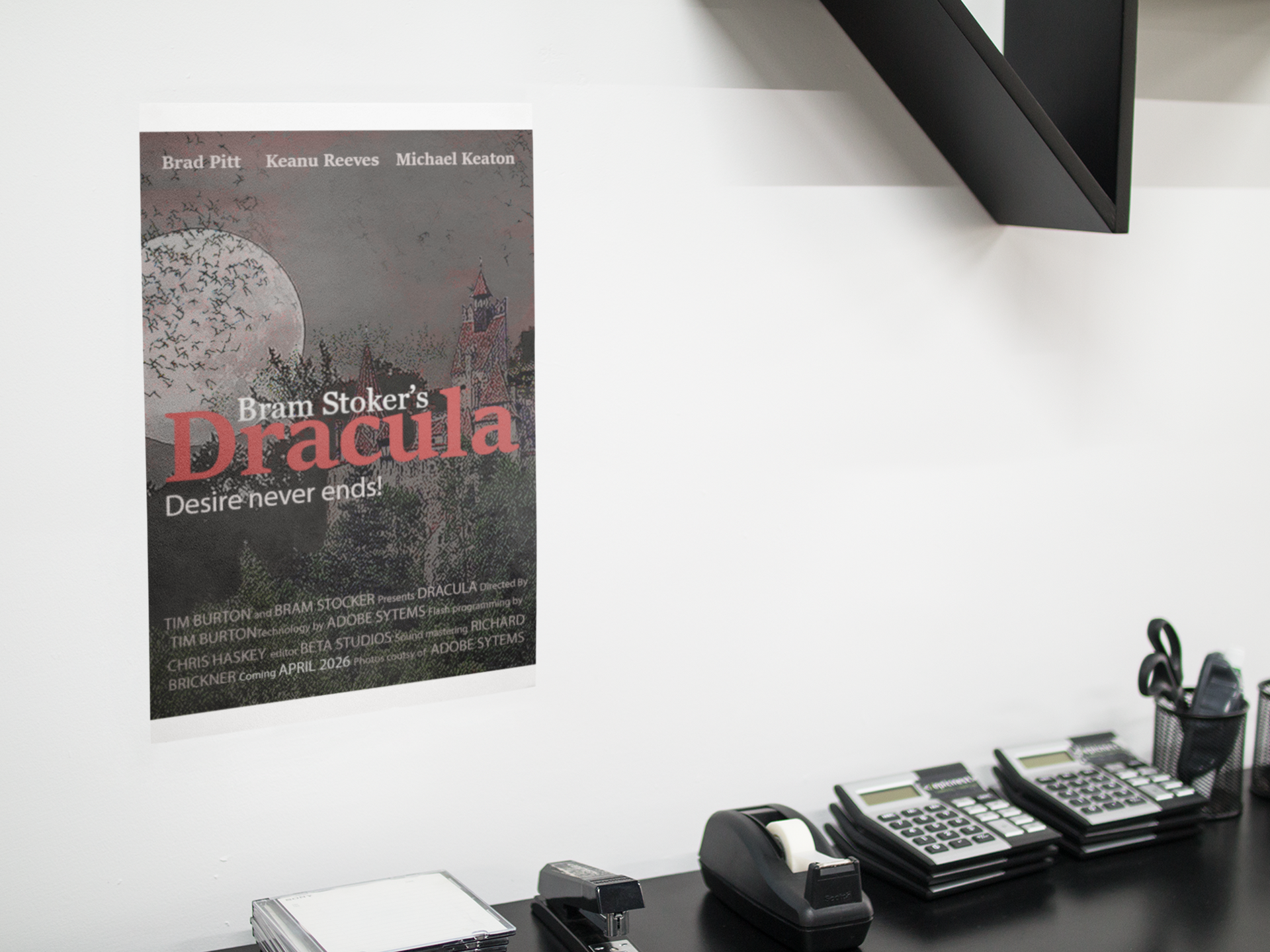
DRACULA
For this project, I reimagined Bram Stoker’s Dracula as a modern movie poster, blending classic gothic elements with contemporary cinematic style. A dark palette of reds, blacks, and grays sets an eerie tone while modern typography with subtle gothic touches reinforces the theme. Symbolic imagery such as shadows, silhouettes, and textured details references key motifs from the novel without cluttering the design. The result is a dramatic, atmospheric poster that brings the essence of Dracula into a modern visual context.
PROJECT DESCRIPTION
RESEARCH & DEVELOPMENT
Brand Strategies
This project explores key brand strategies by defining a clear brand position, developing a cohesive visual identity, crafting purposeful storytelling, and creating a consistent, emotionally engaging experience tailored to the target audience.
Target Audience
The target audience for this project consists of individuals who appreciate modern design with gothic influences, including contemporary horror fans, young adults, and viewers drawn to visually atmospheric storytelling.
PROCESS WORK
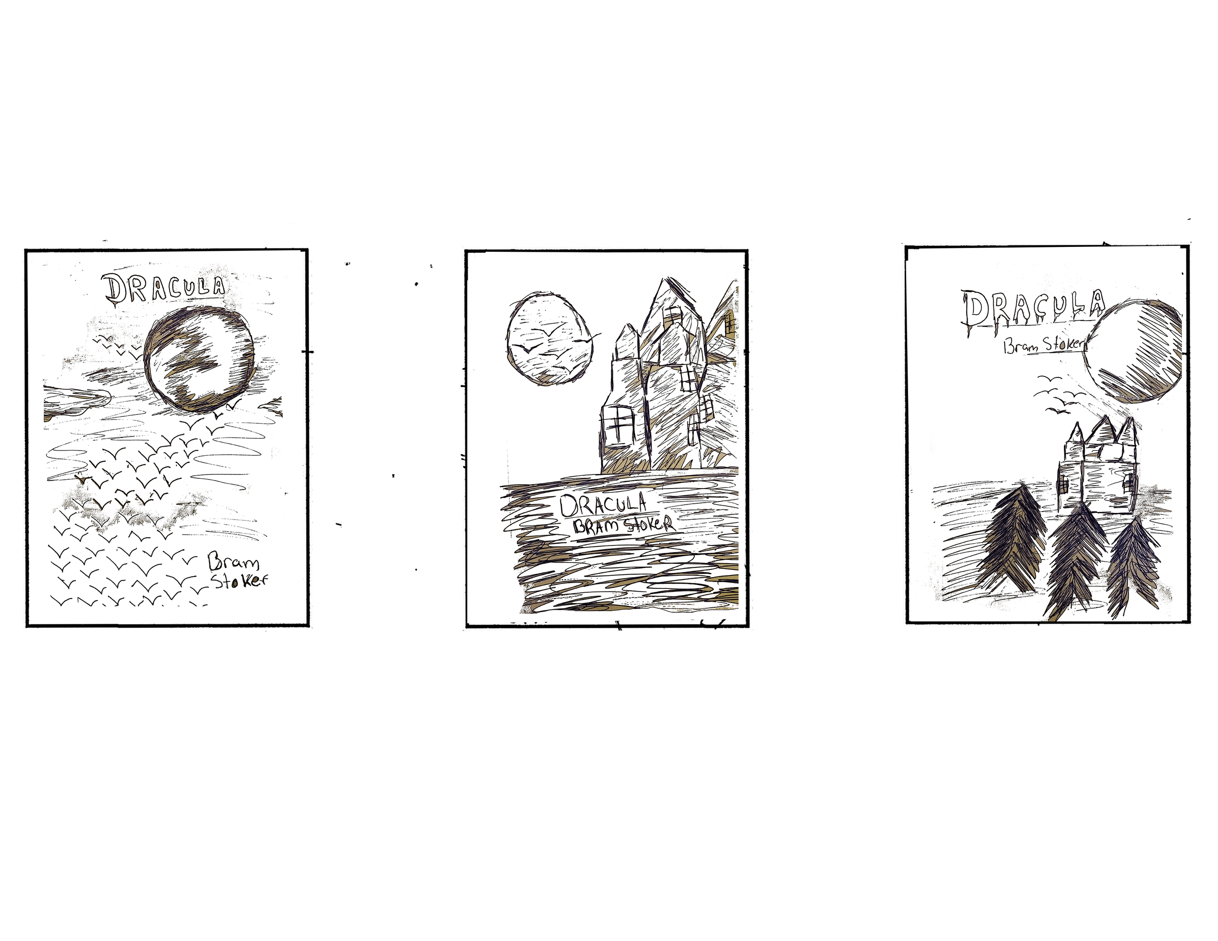
Sketches
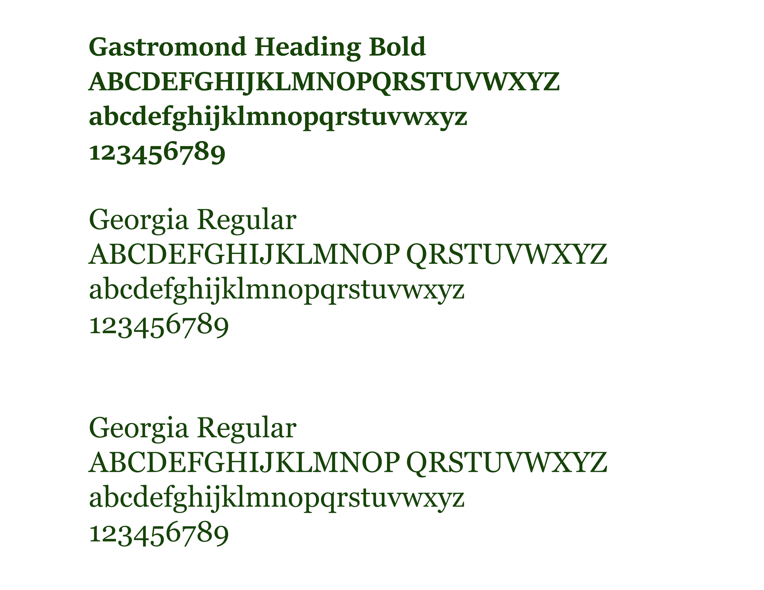
For the typography in my poster, I selected Sitka for the title Dracula and Georgia for the supporting text. Sitka’s sharp, elegant letterforms convey the mysterious and dramatic presence of the character, giving the title a gothic and slightly surreal quality that supports the story’s tone. Georgia provides a clean, classic serif style that pairs well with Sitka while remaining highly readable, allowing the supporting text to feel clear and refined. The combination creates strong visual harmony, enhances the dark atmosphere of the design, and reinforces the overall thematic impact of the poster.
Typography
Color Palette
For my Dracula movie poster, I used a dark, atmospheric color palette featuring shades of red, black, gray, white, and other muted tones to reinforce the film’s eerie mood. These colors evoke mystery and foreboding, aligning with Dracula’s gothic aesthetic. The contrast between deep reds and blacks adds intensity, highlights key elements, and strengthens the overall visual impact of the design.

FIRST ITERATION
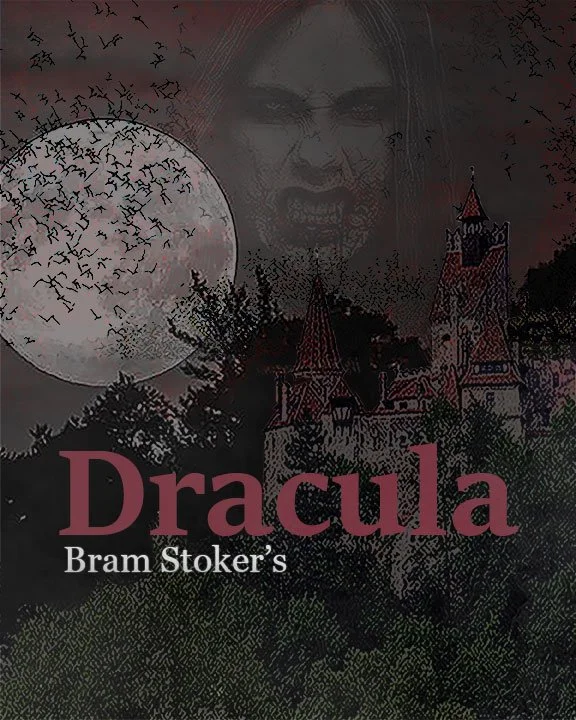
For the first iteration, I focused on highlighting Dracula and his castle. I placed his figure within the sky to create a powerful visual connection between the character and his domain, using their scale as a striking comparison. I kept the dark tones consistent and added bats emerging from the castle to strengthen the gothic atmosphere and enhance the sense of movement and mystery in the design.
Design Decision

FINAL DESIGN
For the final design, I retained the dark, atmospheric tones and the castle as the central focus. I removed Dracula from the sky, letting the castle alone convey the story’s presence. I added actors to give the poster a cinematic feel, adjusted alignments for better visual balance, and included movie-style credits to enhance the authenticity of a modern film poster
Design Decision
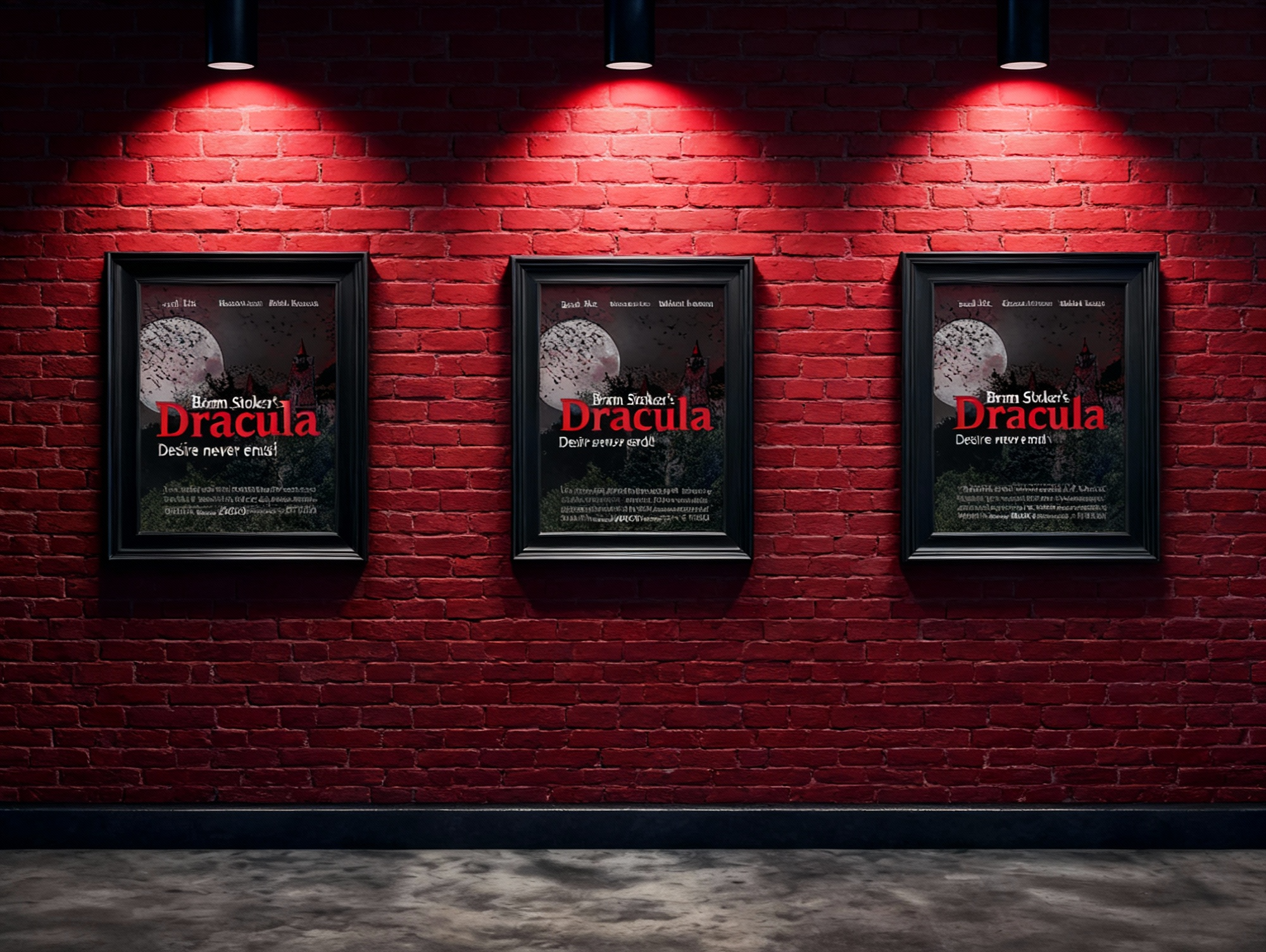
ENVIRONMENTAL CONTACT